- Joined
- Apr 15, 2015
- Messages
- 1,263
- Reaction score
- 863
- Points
- 113
- Age
- 31
- Steam
- sotherius
- XBL
- Sotherius
So hey, i've been playing skullgirls for some time, and i've been posting my stuff on the fan art thread for some time too, but i felt wrong, because i was only posting my stuff there, so, i decided, hey, i should make my fan art thread so i can post my stuff, and admire the other fan arts in the thread, and contribute with stuff from other people if i find.
The thing is, there is another reason why i would like to post my stuff here, in its own thread. Since i decided that i would get back to drawing (last year), i got back without my usual friends that would help me to get better, because i lost contact with them. And i noticed that here, there is a lot of good artists, so, i was thinking: maybe they can help me get better, trough feedback, critiques, and general opinion. I mean, the worst feeling that i have in my life is being a 22 years old man and just so late coming to the realization that drawing is what i really love doing.
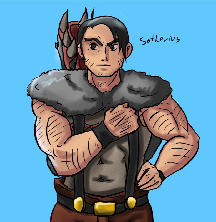
So, without taking the time here is all the Skullgirls fan art i did in the last weeks, all of them were posted on the art thread, i'm just posting here, and future drawings will be here only.
So, here it is, my stuff.
Screaming Filia:
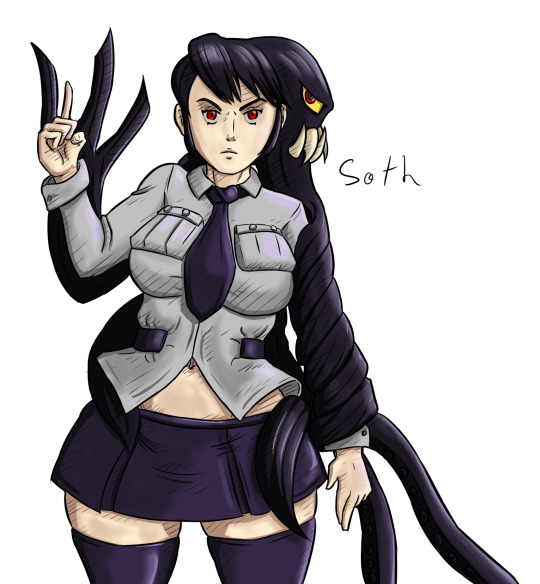
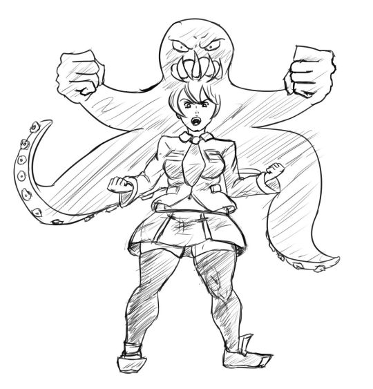
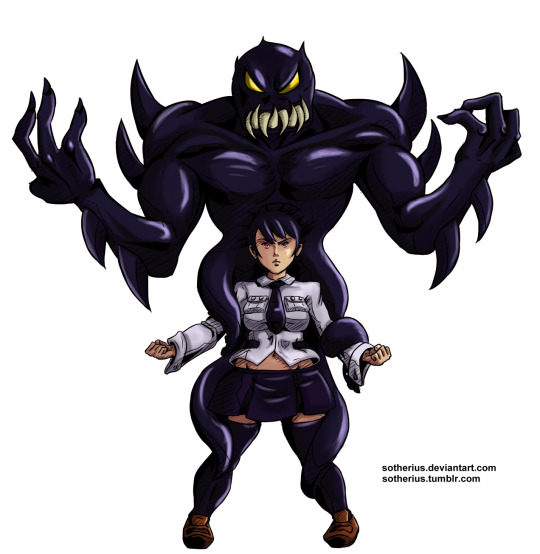
 Raging Leviathan:
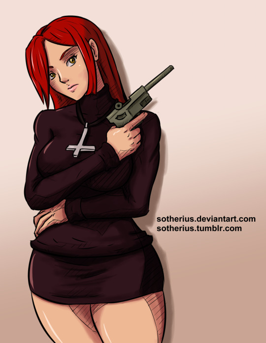
 Parasoul:
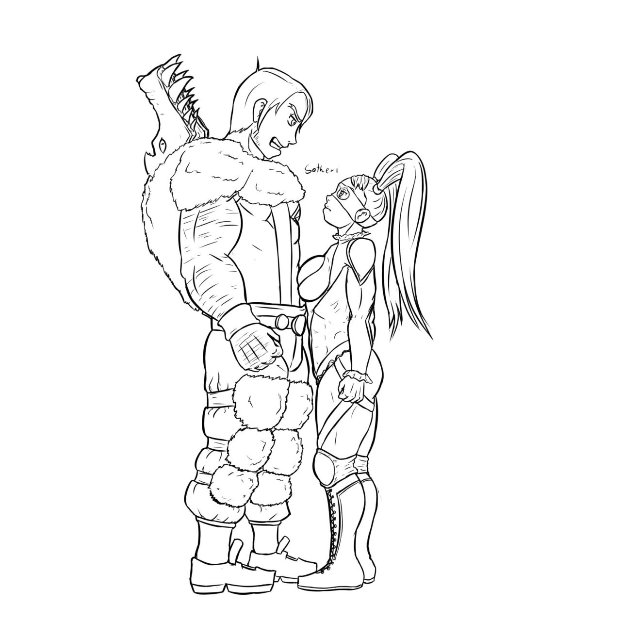
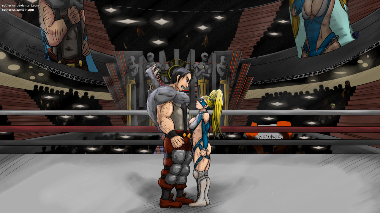
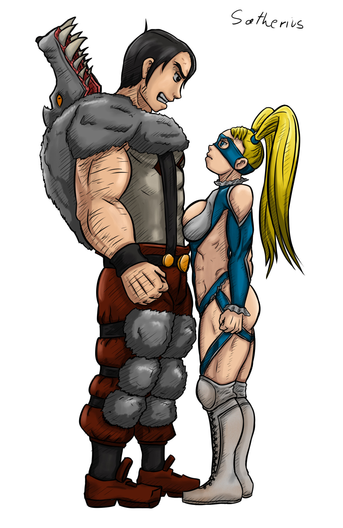
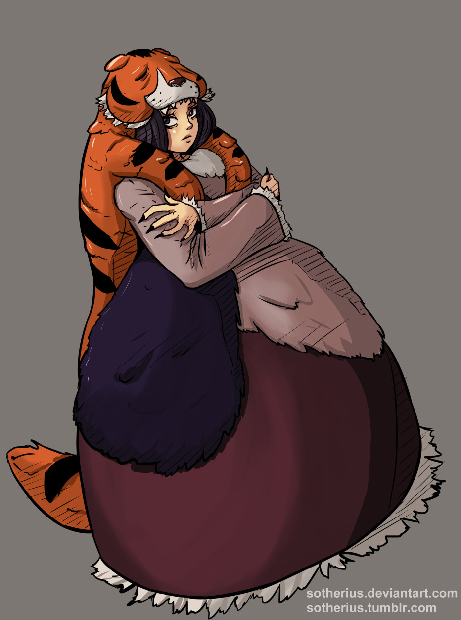
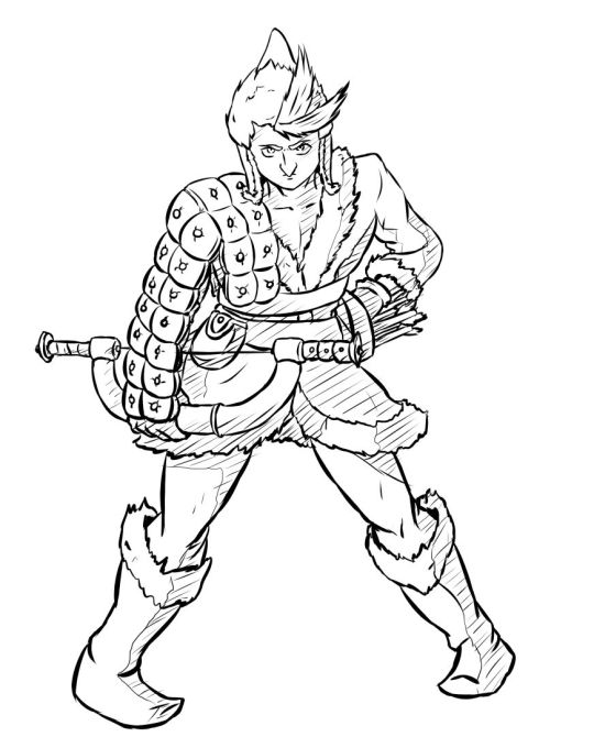
 Beowulf:
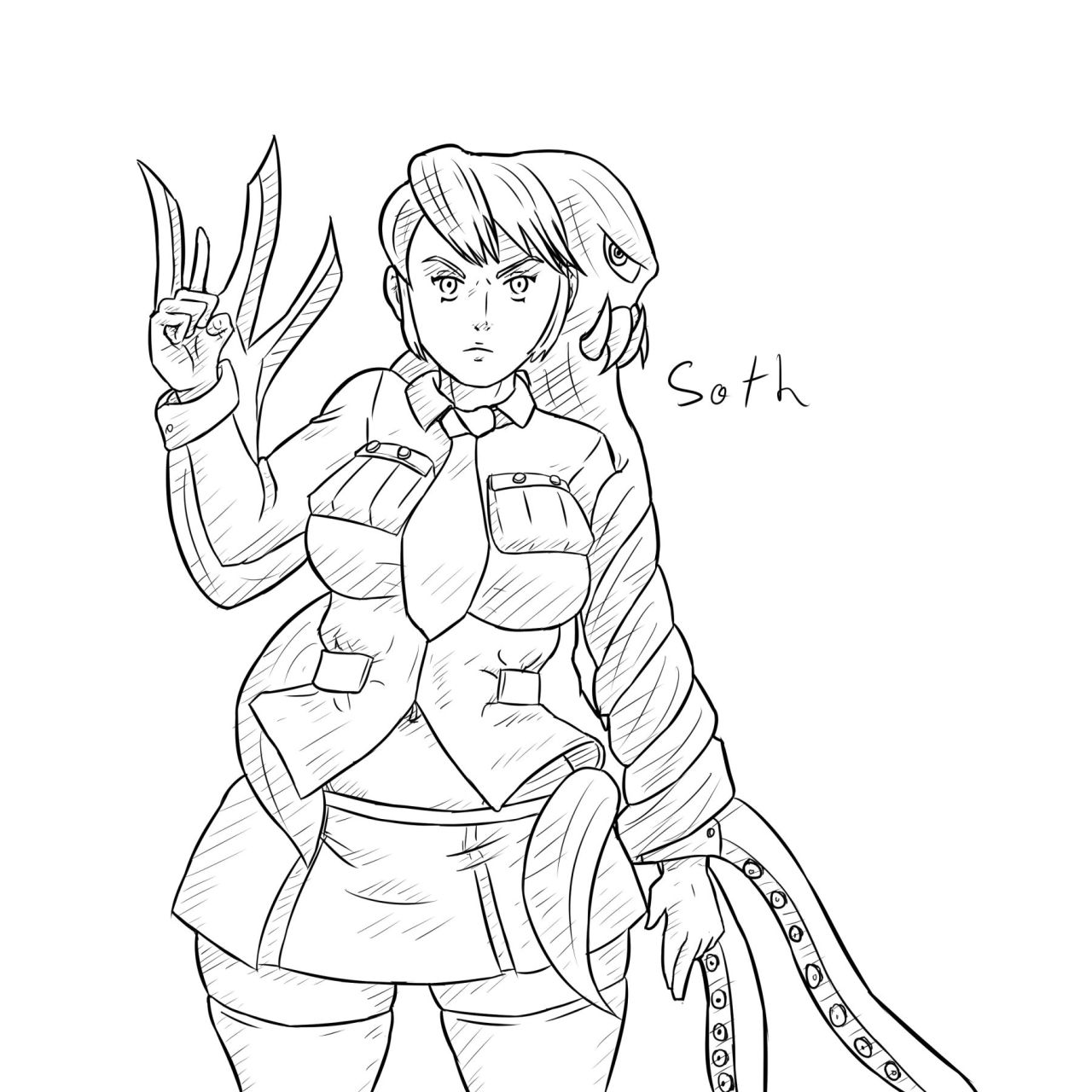
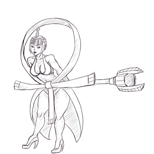
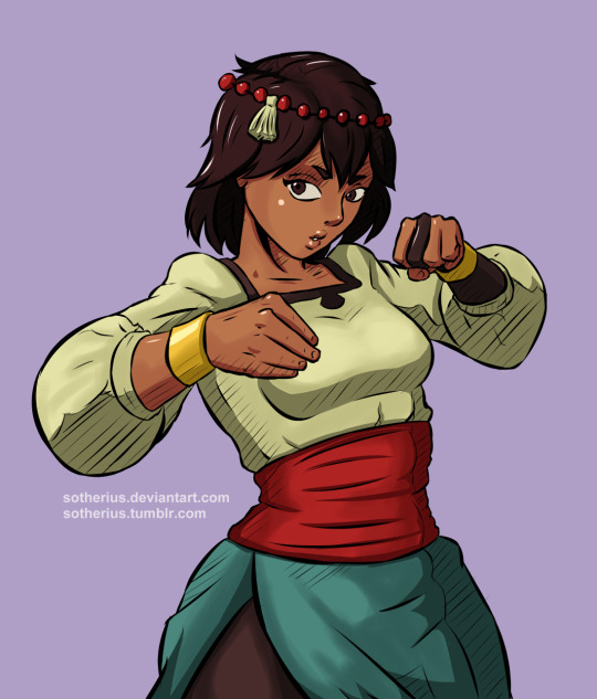
 Cerebella (and she is alive, what a miracle):
 And, my two just line works.
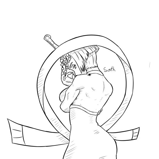
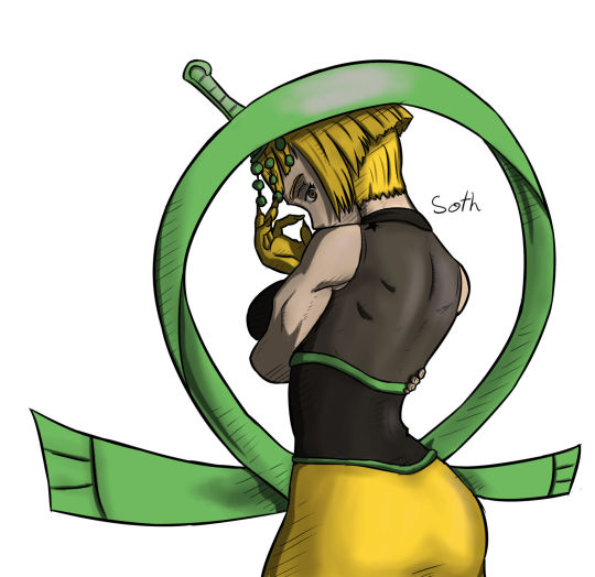
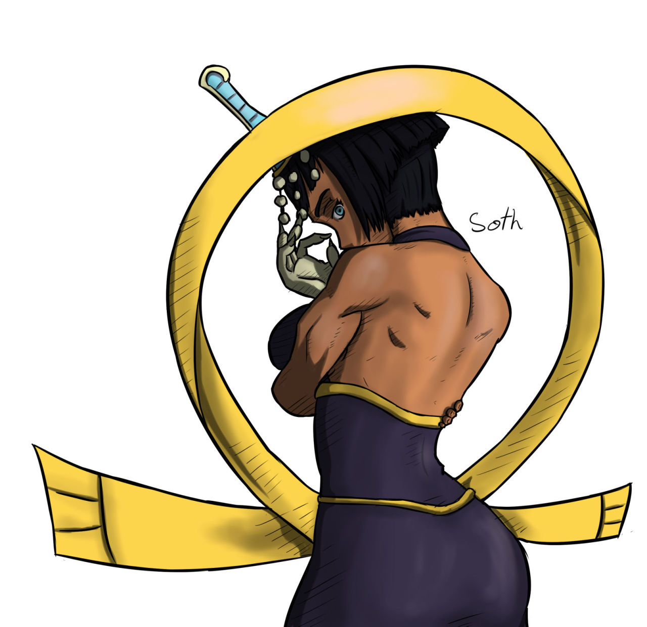
Serious Squigly:
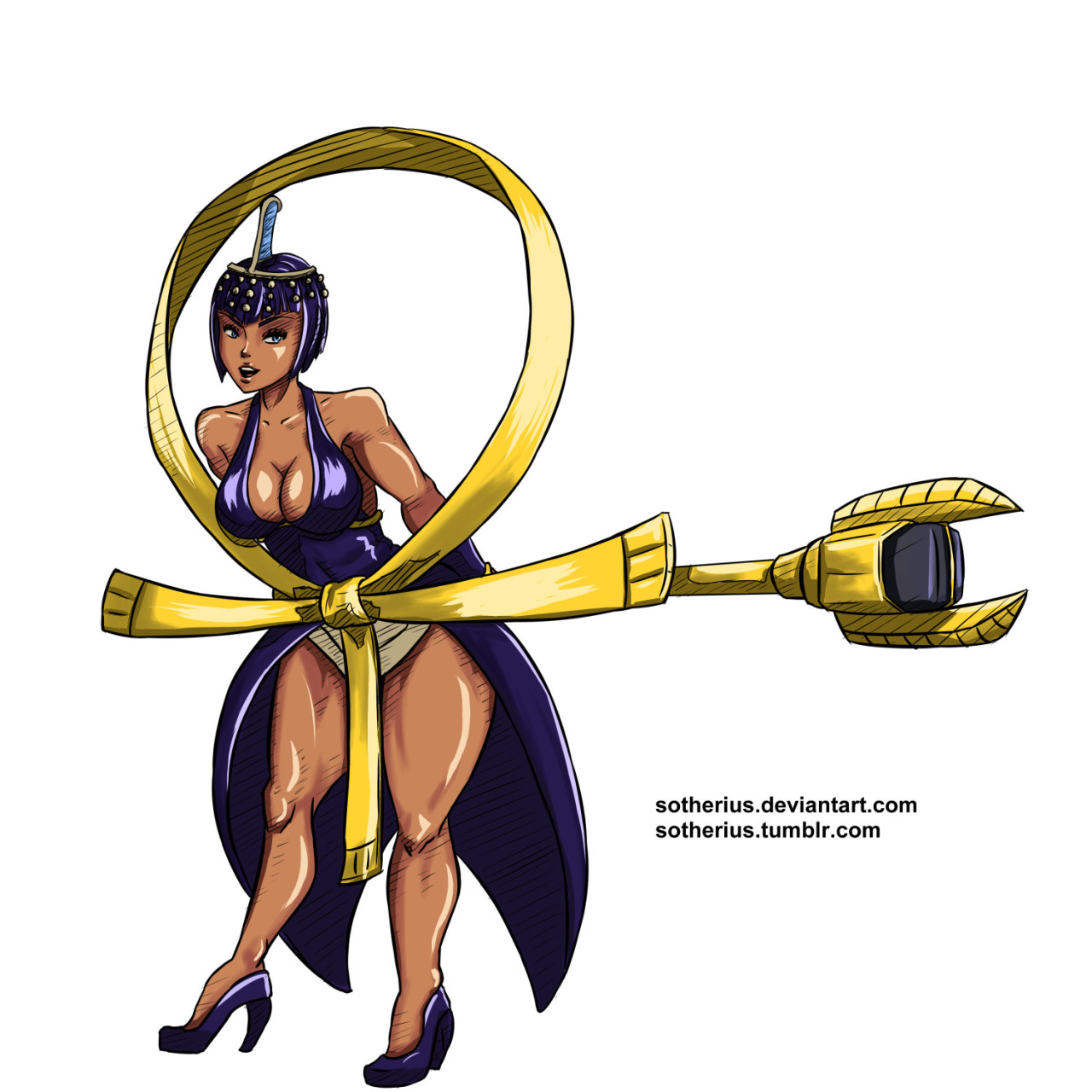
 Eliza:

The thing is, there is another reason why i would like to post my stuff here, in its own thread. Since i decided that i would get back to drawing (last year), i got back without my usual friends that would help me to get better, because i lost contact with them. And i noticed that here, there is a lot of good artists, so, i was thinking: maybe they can help me get better, trough feedback, critiques, and general opinion. I mean, the worst feeling that i have in my life is being a 22 years old man and just so late coming to the realization that drawing is what i really love doing.
So, without taking the time here is all the Skullgirls fan art i did in the last weeks, all of them were posted on the art thread, i'm just posting here, and future drawings will be here only.
So, here it is, my stuff.
Screaming Filia:
Serious Squigly: