- Joined
- Oct 26, 2015
- Messages
- 55
- Reaction score
- 17
- Points
- 8
- Steam
- kioku_chan
I know it's NOT particularly good, but I'll still try to post any relevant art I make here : )
I have some pictures to start inside the spoiler tag!
(Sorry I just noticed that before I typoed and missed the NOT. hehe >_< I make a lot of odd typos)
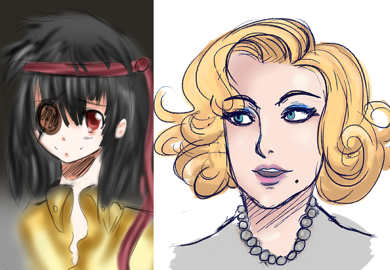
Well.. it's probably not the worst programmer art you've ever seen. (I study computer science and game programming.. so... )
I have some pictures to start inside the spoiler tag!
(Sorry I just noticed that before I typoed and missed the NOT. hehe >_< I make a lot of odd typos)
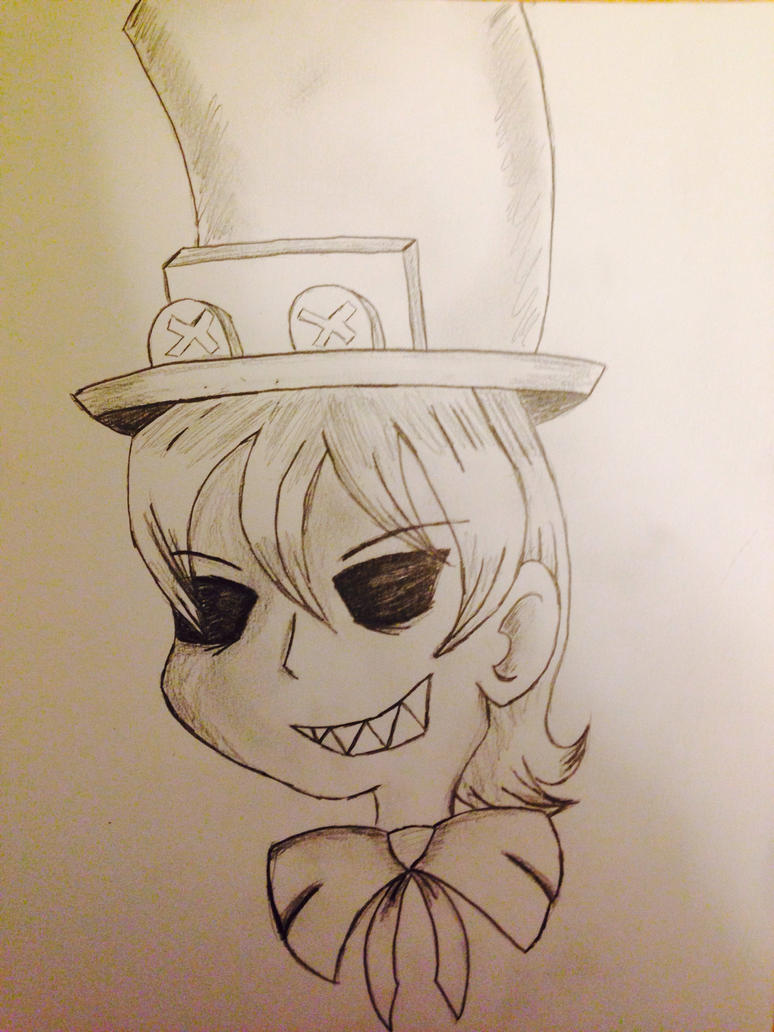
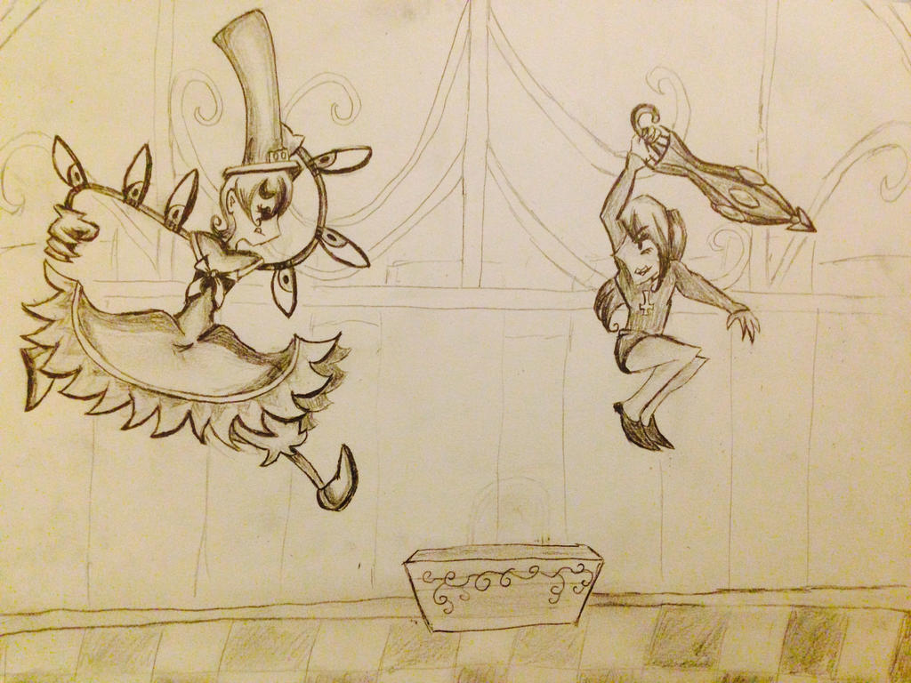
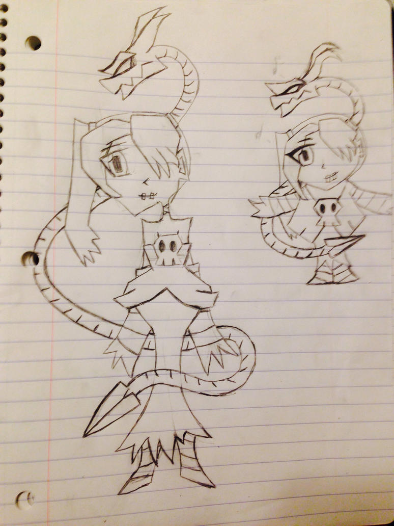
2 drawings of Squiggly testing a new chibi style. Sorry it's on notebook paper, I was on campus.
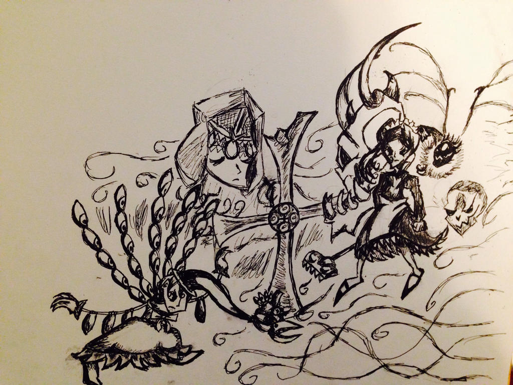
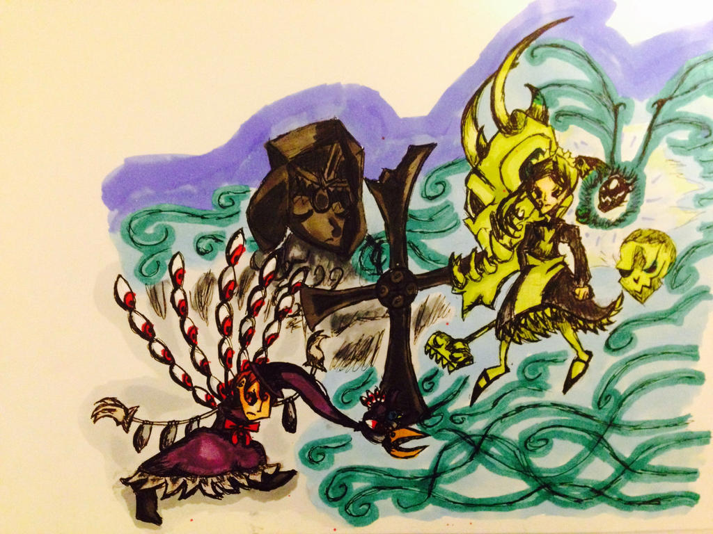
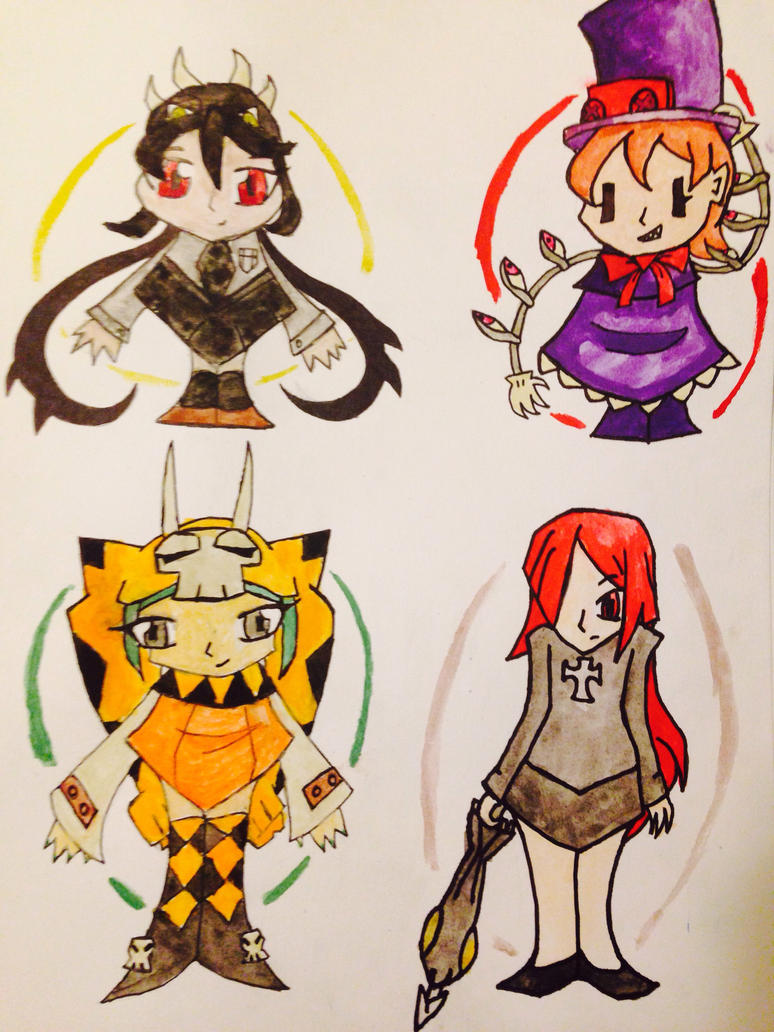
Here is the chibi style on some finsihed pictures. I want to make these into stickers. I outlined them in marker and colored them with watercolors:
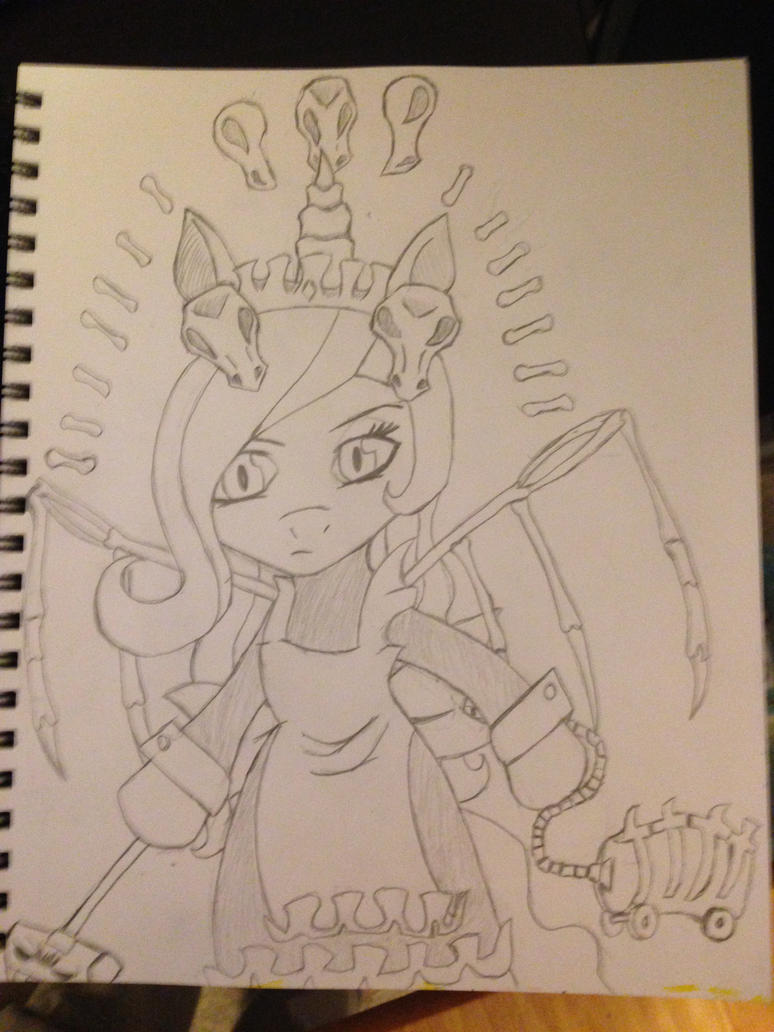
This is Celestia from My Little Pony as Marie (I'm sorry if you hate ponies. I like both though, and thought this was neat). I may try to color it eventually:
Here is the chibi style on some finsihed pictures. I want to make these into stickers. I outlined them in marker and colored them with watercolors:
This is Celestia from My Little Pony as Marie (I'm sorry if you hate ponies. I like both though, and thought this was neat). I may try to color it eventually:
Well.. it's probably not the worst programmer art you've ever seen. (I study computer science and game programming.. so... )
Last edited: