You are using an out of date browser. It may not display this or other websites correctly.
You should upgrade or use an alternative browser.
You should upgrade or use an alternative browser.
Personal Artwork and stuff
- Thread starter Viro Veteruscy
- Start date
guitalex2007
Well-Known Member
- Joined
- Sep 8, 2013
- Messages
- 978
- Reaction score
- 1,112
- Points
- 93
- Age
- 42
- Steam
- guitalex2007
- PSN
- guitalex2007
- XBL
- guitalex2010
She loves it. How much do you want for it?
Also add your sig or something on the bottom right.
- Joined
- Sep 2, 2013
- Messages
- 242
- Reaction score
- 136
- Points
- 43
- Age
- 37
- Joined
- Sep 2, 2013
- Messages
- 242
- Reaction score
- 136
- Points
- 43
- Age
- 37
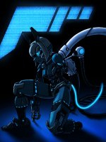
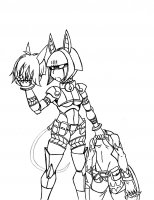
lol thanks. The top one came after the bottom, just was in a different mood at the time when I drew them >w<. I sent a submission to Eighty Sixed so it's up to them now X3
- Joined
- Sep 2, 2013
- Messages
- 242
- Reaction score
- 136
- Points
- 43
- Age
- 37
- Joined
- Sep 2, 2013
- Messages
- 242
- Reaction score
- 136
- Points
- 43
- Age
- 37
Decided to do a Patreon thingy. Basically it'll reward those who contribute to specific tiers with exclusive artwork and lowered commission prices. I plan on adding other rewards as time progresses but for the moment a F#<%! ton of art from me. Also I'm doing a set of pics called the "HUSH" series featuring fanart of specific characters. But yea, just a thing to keep my gears goin >w<
Oh and there are some free art too just to wet a few whistles :3
My Patreon: http://www.patreon.com/Viro

HUSH - Vol. 1

Oh and there are some free art too just to wet a few whistles :3
My Patreon: http://www.patreon.com/Viro

HUSH - Vol. 1

Last edited:
- Joined
- Sep 2, 2013
- Messages
- 242
- Reaction score
- 136
- Points
- 43
- Age
- 37
- Joined
- Sep 2, 2013
- Messages
- 242
- Reaction score
- 136
- Points
- 43
- Age
- 37
- Joined
- Sep 2, 2013
- Messages
- 242
- Reaction score
- 136
- Points
- 43
- Age
- 37
Since I can't post on the thread I made for Buckle... (weird) I'll post here.
Buckle: Slave & Monster MOVING! Buckle will now be on:
Tapastic tapastic.com/series/Buckle-…
Smackjeeves buckle.smackjeeves.com
Patreon patreon.com/Viro
More updates soon
Buckle: Slave & Monster MOVING! Buckle will now be on:
Tapastic tapastic.com/series/Buckle-…
Smackjeeves buckle.smackjeeves.com
Patreon patreon.com/Viro
More updates soon
- Joined
- Sep 2, 2013
- Messages
- 242
- Reaction score
- 136
- Points
- 43
- Age
- 37
Recent additions to my Patreon


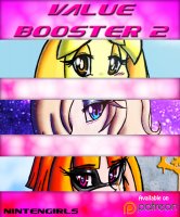
Also Sonic the Hedgehog: Genesis - Episode 29

More to come *goes to bed briefly so can draw more* >w<


Also Sonic the Hedgehog: Genesis - Episode 29

More to come *goes to bed briefly so can draw more* >w<
Last edited:
Mailaka
New Member
- Joined
- Aug 2, 2014
- Messages
- 15
- Reaction score
- 8
- Points
- 3
- Age
- 30
- Steam
- Mailaffin / Peaknock ( It Isn't even a real choice,It's literally both.I changed It so that you people on here may recognize me)
I've looked through your art,and It's pretty cool.It's nice to see the excitement you have with your art.
Buuut,there are some points here and there I notice and like to share for all I can.
First one Is that I think you should take It a bit slower.Take your time In between of making actual pieces and use the time to study and practice,because that's really Important.Else,you'll Improve too slow for your own good.That's why you shouldn't get on with webcomics that quick after starting to make art,because If you're pretty tight on your schedule In general,and you are pretty punctual on when you release new chapters/pages (which Is a very nice thing If you're like that,people really appreciate that),you'll pretty much won't have time left to study and practice,both theory and just practicing things to Improve on.
Second off,I think you should check your proportions more.You seem to get the basic of some anatomy,which Is good.But the proportions look kind of weird.I see a lot of characters having very short legs and arms and sometimes It completely contradicts with the overall weight some of them seem to have.
Third,and last,I really recommend to practice just THAT what you dislike,or hate,or have trouble with.Mastering styles and aspects that you really would rather throw away In the bin can make you even better at what you're doing sometimes.
Fuck,I really have to compliment you on your coloring and background though.Especially this Is amazing :
http://skullgirls.com/forums/index.php?attachments/rf-00-jpg.6784/
the problem Is,If you get ahead of yourself with art while you seem to lack some basics,most times,It really goes the wrong way and It's really hard to get back at learning from the start.But you seem to be doing pretty fine with that,which I'm glad about.
Again,I really recommend just taking your time and do some studying.But most Importantly,to enjoy It and you seem to be having a good time,which makes me glad.Do your best!
- Joined
- Sep 2, 2013
- Messages
- 242
- Reaction score
- 136
- Points
- 43
- Age
- 37
Mhm, I do need to take more time to practice. I'll have to set aside a day for just that (most likely after I'm done with my current commissions). In terms of what I hate, I actually hate coloring >w< My coloring currently sucks so I need to get better at that as well as my backgrounds. And yeah, my anatomy sucks as well lol, need to pay attention more with consistency especially in the Sonic comics case cause I tend to revert a bit with their sizes. But yep, overall I need more practice. Thanks for the comment :3I've looked through your art,and It's pretty cool.It's nice to see the excitement you have with your art.
Buuut,there are some points here and there I notice and like to share for all I can.
First one Is that I think you should take It a bit slower.Take your time In between of making actual pieces and use the time to study and practice,because that's really Important.Else,you'll Improve too slow for your own good.That's why you shouldn't get on with webcomics that quick after starting to make art,because If you're pretty tight on your schedule In general,and you are pretty punctual on when you release new chapters/pages (which Is a very nice thing If you're like that,people really appreciate that),you'll pretty much won't have time left to study and practice,both theory and just practicing things to Improve on.
Second off,I think you should check your proportions more.You seem to get the basic of some anatomy,which Is good.But the proportions look kind of weird.I see a lot of characters having very short legs and arms and sometimes It completely contradicts with the overall weight some of them seem to have.
Third,and last,I really recommend to practice just THAT what you dislike,or hate,or have trouble with.Mastering styles and aspects that you really would rather throw away In the bin can make you even better at what you're doing sometimes.
Fuck,I really have to compliment you on your coloring and background though.Especially this Is amazing :
http://skullgirls.com/forums/index.php?attachments/rf-00-jpg.6784/
the problem Is,If you get ahead of yourself with art while you seem to lack some basics,most times,It really goes the wrong way and It's really hard to get back at learning from the start.But you seem to be doing pretty fine with that,which I'm glad about.
Again,I really recommend just taking your time and do some studying.But most Importantly,to enjoy It and you seem to be having a good time,which makes me glad.Do your best!
- Joined
- Sep 2, 2013
- Messages
- 242
- Reaction score
- 136
- Points
- 43
- Age
- 37
- Joined
- Sep 2, 2013
- Messages
- 242
- Reaction score
- 136
- Points
- 43
- Age
- 37


