• As part of the relaunch of Skullheart, ALL previous threads have been archived. You can find them at the bottom of the forum in the Archives (2021) section. The archives are locked, so please use the new forum sections to create new discussion threads.

Personal Meow-Professor's Art Thread

Meow-Professor

Getting back into the swing of things
Joined
Mar 2, 2015
Messages
1,241
Reaction score
423
Points
83
Steam
Meow-Professor
PSN
Meow-Professor
Filia Cerebella Squigly
(I don't have any idea for a clever title, sorry)

Art is actually my main hobby, with fighting games behind it, so I might as well have one of these. Here's some of it.
I'll update this as often as I can, but I don't draw fanart often, not to mention my tablet has been acting up recently.

I also don't color often, so it will usually just be sketches.
Here's a sketch I did of Squigly the other day.
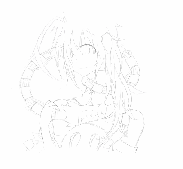
Squigly Sketch.png
I'm aware my style is a bit generic, but I just enjoy drawing like this. I wish it wasn't so... Cute, though.
 
I drew all of Filia's win poses recently.
Here's one of them.
Filia Sketch.png

This is probably my least favorite out of them, mostly because the win pose it is based off of I find very obnoxious. It's the only one I had time to finish, though.
I'm working on an Eliza and another Filia now, although I won't be able to draw for a little while.
 
You have a very soft touch and a cute designing.
That is what I'm trying not to have.
Thanks, though.
 
the bodys are a bit skinny but other then that like what Arogn said its very soft and cute.
 
  • Like
Reactions: Meow-Professor
the bodys are a bit skinny but other then that like what Arogn said its very soft and cute.
With Filia, yeah I noticed that but I was too lazy to fix it. Is it a problem on Squigly too?
 
Hmm I'm no great artist but squigly looks fine. All I would say is the pictures would look a lot better if you inked them. Honestly I think you have a very cute artstyle. just need to work on body proportion.
 
Last edited:
  • Like
Reactions: Meow-Professor
Hmm I'm no great artist but squigly looks fine. All I would say is the pictures would look a lot better if you inked them. Honestly I think you have a very cute artstyle. just need to work on body proportion.
Thanks for the feedback, then.
I'll try to start inking/coloring them more in the future, but I haven't really had the time/drive to.
 
I know the feeling. Honestly only draw, ink, color when you feel motivated. And find a balance between drawing what you want to draw and references. trust me looking up references can help with proportions.
 
A very old (and very rough) sketch of Big Band I never finished.
Big Band Sketch.png
 
Last edited:
  • Like
Reactions: Magma442
I noticed I draw a lot of fan art of characters drinking coffee, and I don't actually like coffee.
My tablet is working again, so hopefully I can start drawing more.
Filia Coffee Sketch.png
I was thinking about coloring this, but I'm not sure if I'll have the time or patience.

Edit: I know nobody is going to see this, but I re-uploaded the image. I had to fix one single line that was bothering me.
 
Last edited:
I'm surprised I've been drawing so much lately.
Here's a quick sketch of Filia
Quick Filia Sketch.png
Sorry I draw a lot of Filia; she, along with Filia Squigly, are very fun to draw because of the parasites.
Edit: Oops, wrong character
 
Last edited:
I need to ask, what are your influences in general?This style, with slender characters seems so familiar. Also, a lot of lines. Very interesting in general.
 
I need to ask, what are your influences in general?This style, with slender characters seems so familiar. Also, a lot of lines. Very interesting in general.
Didn't see alert for this, sorry
Not quite sure why I draw like this. I've never been one for anime/manga (which is what I categorize my style as), so it isn't influenced by an artstyle I found in one of those. I don't specifically go on art websites either, so I don't know, sorry

The lot of lines thing is because I'm lazy, so instead of spending time drawing one line that is shaped the way I want, I just draw multiple ones and don't bother erasing errors.
 
Maybe some videogames? I am reading your first post here, and i see that you want your drawings to be "not cute", and i find that with your style that is very possible, i guess. I actually can see your style being evolving into something almost creepy. Also, what is the thing with cups of coffe?
 
  • Like
Reactions: Meow-Professor
Maybe some videogames? I am reading your first post here, and i see that you want your drawings to be "not cute", and i find that with your style that is very possible, i guess. I actually can see your style being evolving into something almost creepy.
Probably yeah, I used to play a lot of Japanese anime games.
I really don't want my style to be cute, because there are already enough artists who draw cute (that isn't bad, just not my cup of tea), so that is good to hear.
 
Here's the other piece of art that made me mention the coffee thing
Squigly coffee sketch.png
I'm going to run this joke into the ground and draw everyone drinking coffee.
 
Last edited:
But what if they don't like coffee you monster!

I really like these works. However, the lines are really light and that makes it a bit hard to see on my screen at times.
A bit of ACTUAL FEEDBACK: The hair is details, which is nice, but it also just has so many spikes and bits going on that the hair, at least for someone like Squigly, ceases to look like a set of flowing hair. It instead looks like massive bedhair. And this is the case for many of your works. Additionally, and this is probably a nitpick from me, the character's necks seem quite long.

Like the doodles, they're pretty nice overall.
 
  • Like
Reactions: Meow-Professor
However, the lines are really light and that makes it a bit hard to see on my screen at times.
Sorry! My laptop's screen/colors show up weird, so I couldn't tell.
The hair is details, which is nice, but it also just has so many spikes and bits going on that the hair, at least for someone like Squigly, ceases to look like a set of flowing hair.
I do this on purpose, but if it doesn't look nice to other people, I'll avoid it.

Thanks for the feedback!
 
It's not that i think you need to avoid it, I just think that it's important to keep the character's hair style in mind. There are other details, like faux-shading for flowing hair to make it look glossy or well kept, that can help keep that level of detail while making it look less like bed hair. Not saying you should change the way you do things, though, it still looks great.
 
  • Like
Reactions: Meow-Professor
There are other details, like faux-shading for flowing hair to make it look glossy or well kept, that can help keep that level of detail while making it look less like bed hair.
I don't do it because it just adds more detail to that part of the hair (although I completely understand why someone thinks of it like that), it's just.. I like the bed-hair thing.
Not saying you should change the way you do things, though, it still looks great.
You don't need to be sorry for having a legitimate criticism of things, I appreciate any feedback.
 
Okay, i'll try to do that, which is hard for me, but let's see what i can help here.

- In general, you have a very determined style already, so, i can't tell you to go against that. But, there is some things, you have a very cool way to do clothes and hair, but first, i can say, try at least use dark colors, since your lines are very thin, is difficult to see them, so, at least changing the color to pure black will help a lot.
- Another thing, is basically fundamentals, i mean, while the long neck, and long body in general is a thing for your style, the shoulder, and the torso isn't fitting with the body, the construction of the body isn't very well done. It seems that you go straight for the final product instead of building some form of basis to work the body, this can help a lot. Try to do some gesture drawing, study about of the human body, is something cliche to say, but really, that works a lot.

And, while not a critique, i'm going to tell you something, that might be not what you are looking for, but might help.

The thing about cuteness, i think it can be cut off if you just change the eyes and facial expressions.

And also, i like that your hands, look like hands, they seem natural, i think they are too small, but i am not sure if it is style, or anything like that.

And i think another very common tip, is try to mirror your drawing (using digital tools or looking under the paper by some light), because that breaks the image that you brain has been forming of the drawing and helps identifying mistakes.
 
  • Like
Reactions: Meow-Professor
Thanks for writing this
- Another thing, is basically fundamentals, i mean, while the long neck, and long body in general is a thing for your style, the shoulder, and the torso isn't fitting with the body, the construction of the body isn't very well done. It seems that you go straight for the final product instead of building some form of basis to work the body, this can help a lot. Try to do some gesture drawing, study about of the human body, is something cliche to say, but really, that works a lot.
Could you clarify this a bit more for me? You're saying stuff is out of proportion, right?
I draw the body first, and then draw clothes around it, like you mentioned. I don't go straight to the clothes, no.

I do a lot of proportion studies actually, but I don't know how to put it... Normal proportions don't look good to me in my art, I guess? It is what caused my bodies to be tall and slender like you said.
I'm usually trying to do broad shoulders, tall bodies, and stuff like that.

The thing about cuteness, i think it can be cut off if you just change the eyes and facial expressions.
Yeah the cuteness is toned down a lot with different expressions/eyes, but I feel like my problem is that I don't want to have to avoid certain expressions for my art to not be cute. My eyes are admittedly very cute though, but I feel like I don't have the ability to draw things that aren't cute well.

And also, i like that your hands, look like hands, they seem natural
This makes me very happy, considering hands used to be one of my biggest problems. The small hands thing is kind of deliberate, I like the way it looks.

And i think another very common tip, is try to mirror your drawing (using digital tools or looking under the paper by some light), because that breaks the image that you brain has been forming of the drawing and helps identifying mistakes.
I use this, it helped me improve a lot when I first started. I didn't know you could do that on traditional paper, though
 
Not that is out of proportion, because the proportion is your thing, but is not, fitting.
This drawing:

And this one:


The first one, the way the head connects to the neck, and the neck connects to the body, it doesn't seem convincing, and in the second, i think the inner breast is a bit strange, and her legs, it seems that you didn't try to do very slender legs, you just, did almost straight lines and put something to indicate the knee.

I think, you should look for, is that shoulder in the right place? her torso is not that much to right or to the left considering the perspective and the position?

And other thing, don't ignore the legs, i made this mistake, focusing on learning hands and arms because legs and feet seems naturally easier, but it is a mistake, legs/feet are just as hard as hands/arms.
 
The attachments aren't working for me, but I'm assuming you're referring to the Filia art (only one with legs) and my recent Squigly one?
Yeah I noticed the neck thing with the Squigly art as well, but by then I had already done clothing when I finally sat back to check my work and I just couldn't be bothered
I can't tell what is wrong with Filia's inner breast, though... It is too low down, right?
And other thing, don't ignore the legs, i made this mistake, focusing on learning hands and arms because legs and feet seems naturally easier, but it is a mistake, legs/feet are just as hard as hands/arms.
I'm fine with my legs right now (the Filia one is old and is really the first time I bothered with legs), but feet are the most frustrating things I've ever tried to do. My shoes look odd, like their ankles are broken, just.. That'll take a lot of time to work on.
 
That was everything i could point out. Now i'll just wait to see more stuff.
 
That was everything i could point out. Now i'll just wait to see more stuff.
Thanks again, I'll add more art soon.
 
I do this on purpose, but if it doesn't look nice to other people, I'll avoid it.

Like with clothing IRL, I think the first one who should like a drawing is the artist. Constructive criticism is great but you shouldn't necessarily change things just because you're afraid of it. The artist is the only one who can draw its own art and the one that advances it through experience and criticism but most importantly what he/she likes to make. At least that's what I personally think.

What North said about the hair is right but you should take it easy.
 
My internet was out for a couple of days, so I had the time and the drive to actually color something.
Cerebella Fanart.png
I'm not happy with the hair shading; could have fixed it, but I was just tired of drawing.
I'm aware she's darker skinned but I forgot when I had already finished shading it

Edit: I noticed I uploaded the wrong version, sorry.
 
Last edited:
Only advice I can give (and admittedly its a problem of mine too.) is the hair styles look the same or similar between all your drawings you might want to learn more hairstyles.
 
  • Like
Reactions: Meow-Professor
Only advice I can give (and admittedly its a problem of mine too.) is the hair styles look the same or similar between all your drawings you might want to learn more hairstyles.
I never noticed that, I'll work on it, then. Thanks.
I re-uploaded the last piece of art, I had the wrong version up. It has a layer unhidden.
Also, I'll take requests if I have time.
 
No problem all you need to do to fix hair is find a basic shape. I like to use references when i practice my art. Characters, real models, other prices of art, etc could help improve.
 
  • Like
Reactions: Meow-Professor
Dude you're stuff is amazing, i'm really feeling Tim Burton here, and he's one of my favorite artists.
The style is just fantastic.
 
  • Like
Reactions: Meow-Professor
Here's some Parasoul art I finished today.
Parasoul fanart.png
I'm surprised how much I've been coloring my art lately.

Edit: Re-uploaded because there were a few errors that were really bothering me (how the design on her cup looked like it was shaded completely differently from the cup itself, I forgot to do a final touch, and a few lines for the hair going over other parts of the hair incorrectly).
 
Last edited:
Holy Crap that's great! However, Parasoul's arms and hands are really small. Like, REALLY small compared to her head and bust. On the bust, it appears to droop a bit too far fowards, so it looks like they're....kinda sagging, maybe? I dunno how to put it but it looks a bit awkward. The face and detail are great, though!
 
  • Like
Reactions: Meow-Professor
Here's a quick sketch of Aeon
Aeon Sketch.png
For once there's no coffee
I really love her design, easily my favorite in the game.
I might color this later, but I've been coloring a lot lately and am slightly bored with it.
 
A rough sketch of Feng-
Feng Sketch.png
I've had this in progress for ages, and I didn't feel like drawing anything new so I just finished it. Sorry about her right hand, I was too lazy to actually draw it.
Quick question, are the lines dark enough? I remembered to actually darken them this time.
 
Yes, now they are dark enough to be seen.
 
Some of the wrinkling in Feng's clothes in this pic look off to me. Particularly the one about her chest. I mean, her chest seems a bit inflated from its normal size here anyways, but the wrinkles make the whole thing look loose, a lot more loose than you'd expect Feng's clothes to be. Also, her leg is bending at a really awkward position. It might be possible to a degree, but from my perspective, it looks like the leg just flips straight up on the joint under the hip, and looks really weird. Maybe its just me. Great detail, though :D
 
Some of the wrinkling in Feng's clothes in this pic look off to me. Particularly the one about her chest. I mean, her chest seems a bit inflated from its normal size here anyways, but the wrinkles make the whole thing look loose, a lot more loose than you'd expect Feng's clothes to be.
Hahaha, you can just say it, I draw big breasts.
Sorry, I couldn't make the tight clothing look detailed.

Also, her leg is bending at a really awkward position. It might be possible to a degree, but from my perspective, it looks like the leg just flips straight up on the joint under the hip, and looks really weird. Maybe its just me.
I'm really struggling with my legs actually. They look fine themselves but I don't know how to make them bend naturally. it is something I'm really working on (along with depth, this gives me trouble).