Coupla things:
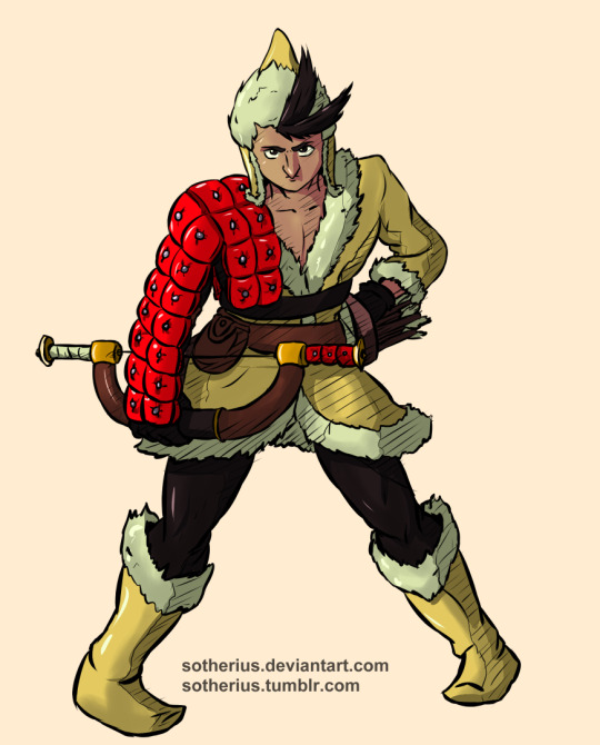
-With how he's positioned, with bent back and angled head, Zebei's bow arm seems really short. Since he's hunching or bending forward slightly, the arm should extend down a bit past the hit, probably closer to the knee than it is. Doesn't need to be extended by a mile, just a bit.
-The issue with the face is probably due to proportions. His face here looks pretty small and I think making a bit more room to push his eyes up and out slightly would have helped, given the size of the hat and hair parts you gave him. The nose could probably have been a bit pointier. Comparing to art fro the game, Zebei's nose is a bit sharper, so that contributes to making his head looked angled, which contributes to the perspective problem going on with the face.
-Despite what's above, the shading and detail are honestly pretty good. There aren't that many areas that look too dark or too light, and it flows really well, but it flows towards the face, which is again part of that same perspective problem you've got going on here. The details and shading wouldn't need to be upped much, though, they're pretty ace as I said.
Hope some of this comes in handy. :D
