• As part of the relaunch of Skullheart, ALL previous threads have been archived. You can find them at the bottom of the forum in the Archives (2021) section. The archives are locked, so please use the new forum sections to create new discussion threads.

Salty Updates 27 Dec 2013

Vadsamoht

Well-Known Member
Administrator
Administrator
Joined
Aug 30, 2013
Messages
2,417
Reaction score
2,147,483,647
Points
113
Age
34
Steam
Vadsamoht
Ms. Fortune Robo Fortune
Tonight on the eightysixed Salty stream, A few more updates for the game were revealed, including:
  • Health bars now appear green while at 100% in order to make it easier to see when you get a perfect. For solo matches, this only applies for the first lifebar.
lifebars.png
  • Menu sounds are fixed
  • Big Band is mostly working on PS3, but still needs a little more work.
  • Confirmation that Big Band's stage is in the works.
  • Big Band's win pose added.
Short 'n' sweet. We'll keep this post updated if anything else comes to light!
 

Attachments

  • lifebars1.png
    lifebars1.png
    52.8 KB · Views: 470
Last edited:
not a big fan of the green, i don't feel like it compliments the other health bars
 
I like it. Green is "Go", so it makes the most sense to be in the lifebar at the start.

But man oh man I'm hyped for Big Band's stage. Is it like, a ruined police station? Or a jazz hall?

And the music better be some smooth ass jazz with a sick sax solo in the middle.
 
I'd be ok with the green and a very slight gradient to a yellow-green color compared to what was shown, but that's just me.
 
hey this should be updated but Big band has new effects such as "space jazz" win pose and super sonic jazz have new effects, among others
 
Green looks pretty gross not going to lie, it was fine before.
 
  • Like
Reactions: Kai
A lighter green, more akin to a neon light than whatever this is, would fit far better with the typical colours in the game and, more specifically, on the current life bars. I also don't think the full life bar should fade to black on the far right.
 
  • Like
Reactions: DawnHibiki
Why not just a solid yellow color, like how SFIV does it? I will agree that the green color is kinda yucky looking.
 
eh, most of the time you will only see it for like <5 secs anyway so no bigs.
 
I like the green. It contrasts nicely against everything else, which would in theory, draw the opponents eye to the health bar. Which would really put a little more pressure on them to try and hit you.
I think.
Armchair Color Theory~ HOOOOOO~~~!
 
I approve of the health bar.
 
I like the idea but I do think that a solid color might look nicer. Also I don't really care for how it looks on teams with characters that haven't been hit yet combined with those that have. The uniformity looked cleaner.
 
  • Like
Reactions: Broseidon Rex
I like the idea of having green, just not this shade of green
 
I think it would of been better to just make it 1 solid color for perfect health but I don't mind it.
 
Mike Z is here hide your opinions, he said on stream if he sees any complaints it is final
 
I'll direct Brady to this thread so he can privately laugh at all y'all. Me, I don't care, but I gotta implement the rest of this either way. :^P
 
I'll direct Brady to this thread so he can privately laugh at all y'all. Me, I don't care, but I gotta implement the rest of this either way. :^P
Laugh at what? That people are sharing their thoughts on a public forum? It's almost like that's what forums are for.
 
Oh, I meant the "One more reason not to get perfected" and so he can see people's thoughts (a cool trick!) but I can see how that could be misinterpreted. Whoops.
 
  • Like
Reactions: Arcana
Mike loves it when he gets other suggestions to a thing that he didn't ask for/nor had to do. He also really loves opinions, so keep asking.
 
I like it a lot, actually, seeing how so many people disliked it really surprised me...
 
  • Like
Reactions: CapnWTF
I mean, I get the idea (better visibility for 100% lifebar), but that shade of green is just... wrong. I can't put my finger on it, but it looks wrong.
 
I have no real opinion about the colour either way. For those who don't like it what colour would you rather have? Bonus points if you photoshop an image as an example.
 
I want blue health, my opinion clearly matters. Do it.

(As long as health is tracked properly I don't care what color it is.)

I just don't like that everything is Green in the beginning, your first bar of meter, the undizzy bar, and now your health (for like probably not even that long). I don't really look at the bars in the game though. That's probably why I'm bad at this game.
 
  • Like
Reactions: Kai and Arcana
green should only be for the character on point it looks weird to have a bunch of different characters, and after all if the character on point loses health it is still not a perfect victory
 
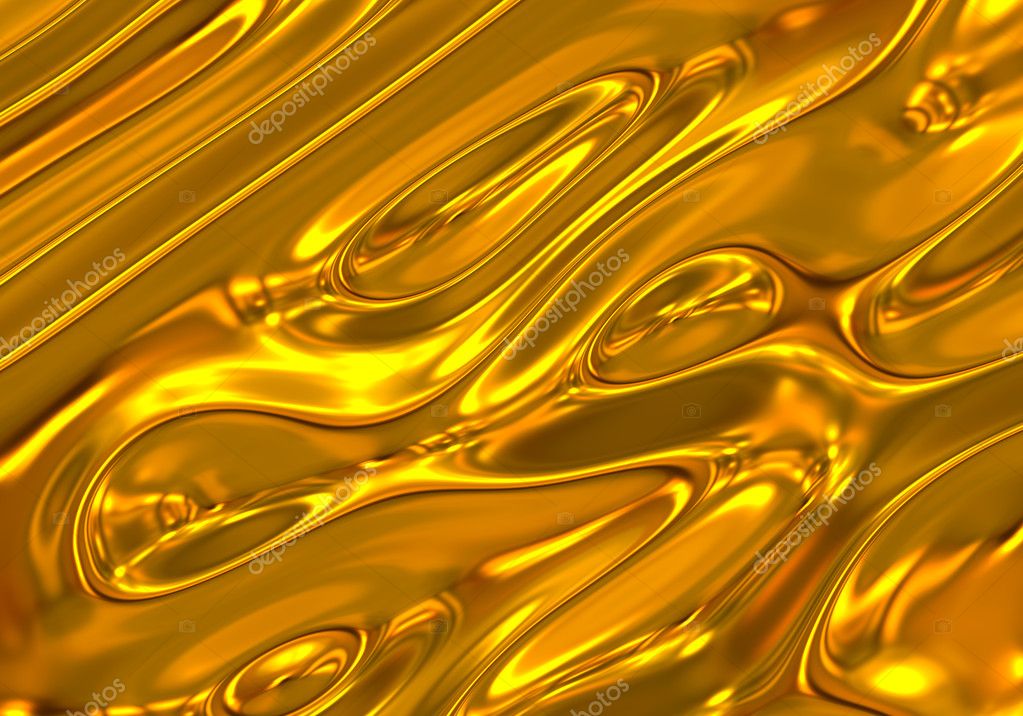
they should make the perfect health bar a nice sparkly golden colour.
like this but without all the waveyness

depositphotos_9171170-Liquid-Gold-Background.jpg

and then the announcer can say "you are gold!'

or "because you're worth it"
 
I wouldnt mind a gold, It fits in with the theme of Skullgirls, and compliments the other health bars so it wouldnt look funky in battle
 
  • Like
Reactions: Broseidon Rex
Js6ynNI.png

I think this is better. I love you photoshop c:

(Also I'm just finding excuses to use photoshop so don't pay any attention to these.)
Mike should see this. Too beautiful!!!
 
The green just doesn't fit, and it's actually distracting (in a bad way). A better idea would to be to give the player a number of different color palette options for tinting, and let them select the one they like, just like with characters. Or maybe even provide some RGB sliders to allow the players to customize the tinting. At the very least Mike & co. should give people the option to turn the tinting off on the config screen. That way, everyone wins. Simultaneously. In a fighting game. Mind blown!
 
  • Like
Reactions: WrestlerGuile