• As part of the relaunch of Skullheart, ALL previous threads have been archived. You can find them at the bottom of the forum in the Archives (2021) section. The archives are locked, so please use the new forum sections to create new discussion threads.

Tweaks to the 2D Training Stage background

KuroOneHalf

Artist & summer addict
Joined
Sep 19, 2013
Messages
80
Reaction score
184
Points
33
Steam
Kuroonehalf
Eliza Filia Cerebella
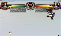
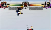
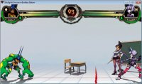
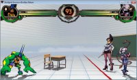
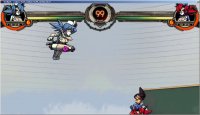
Often times when I end up fighting in this map, in the middle of the action I'll suddenly find myself disoriented as to where I am or how high I am. The reason for this is most of the background is just white. In the 3D version you can see more of the horizontal paper lines due to the parallax but in the 2D version where it was flatted down those are very muted.

In screenshot #1 I'm at roughly superjump height just above the chalkboard. In the second picture I'm on the left corner. Not very easy to tell. Part of it could be due to my laptop monitor not having the best color fidelity but I literally only have this problem with the training stage map. Would it be too much trouble to tweak this a little so that the background lines are more visible (particularly in the air)?
 

Attachments

  • 1.jpg
    1.jpg
    215.9 KB · Views: 601
  • 2.jpg
    2.jpg
    238.1 KB · Views: 601
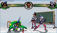
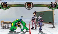
I took some more evidence of the crime scene. I think these exemplify much better what I mean. Hopefully something is done about this eventually. :<

ps: Both examples were taken at the same character placements - the game start positions and when P1 walks all the way to the left.
 

Attachments

  • 1 2D.jpg
    1 2D.jpg
    286.2 KB · Views: 563
  • 1 3D.jpg
    1 3D.jpg
    332.8 KB · Views: 1,846
  • 2 2D.jpg
    2 2D.jpg
    269.3 KB · Views: 587
  • 2 3D.jpg
    2 3D.jpg
    318.1 KB · Views: 506
Last edited:
Oooh, that looks way nicer. Looking forward to trying it out.
 
Not to be annoying but did this perhaps get forgotten again? ;u;

It's cost me a few matches since the last post already, where I dropped crucial combos in the corner because I got disoriented as to whether my character was going up or down. There just isn't enough detail in most of the background to keep proper reference on the movement of the characters.
 
Last edited:
Not to be annoying but did this perhaps get forgotten again? ;u;

It's cost me a few matches since the last post already, where I dropped crucial combos in the corner because I got disoriented as to whether my character was going up or down. There just isn't enough detail in most of the background to keep proper reference on the movement of the characters.
It is now added in today's patch.