• As part of the relaunch of Skullheart, ALL previous threads have been archived. You can find them at the bottom of the forum in the Archives (2021) section. The archives are locked, so please use the new forum sections to create new discussion threads.

well... it's something

KiokuChan

Member
Joined
Oct 26, 2015
Messages
55
Reaction score
17
Points
8
Steam
kioku_chan
Filia Peacock Painwheel
I know it's NOT particularly good, but I'll still try to post any relevant art I make here : )
I have some pictures to start inside the spoiler tag!
(Sorry I just noticed that before I typoed and missed the NOT. hehe >_< I make a lot of odd typos)

2 drawings of Squiggly testing a new chibi style. Sorry it's on notebook paper, I was on campus.
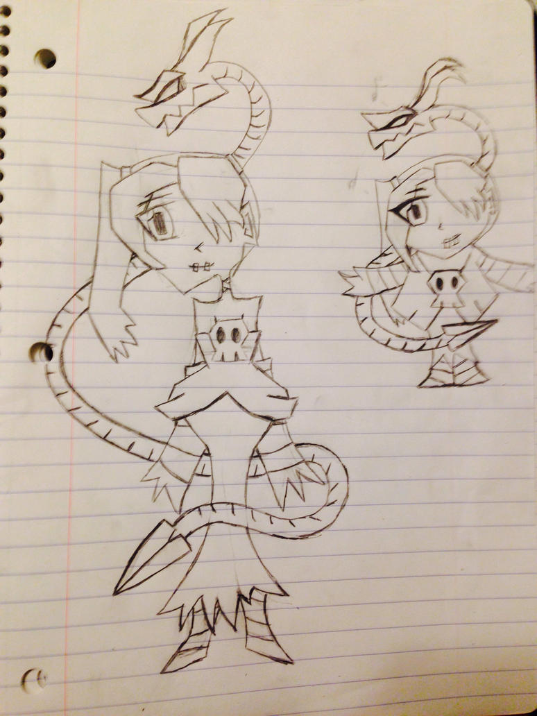
new_chibi_style_sample__squiggly__by_rukariotrainer-d9o8yew.jpg


Here is the chibi style on some finsihed pictures. I want to make these into stickers. I outlined them in marker and colored them with watercolors:
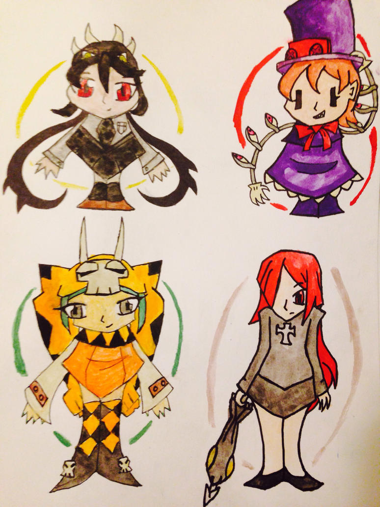
finished_skull_girl_art_in_new__chibi_style_by_rukariotrainer-d9o8ymb.jpg


This is Celestia from My Little Pony as Marie (I'm sorry if you hate ponies. I like both though, and thought this was neat). I may try to color it eventually:
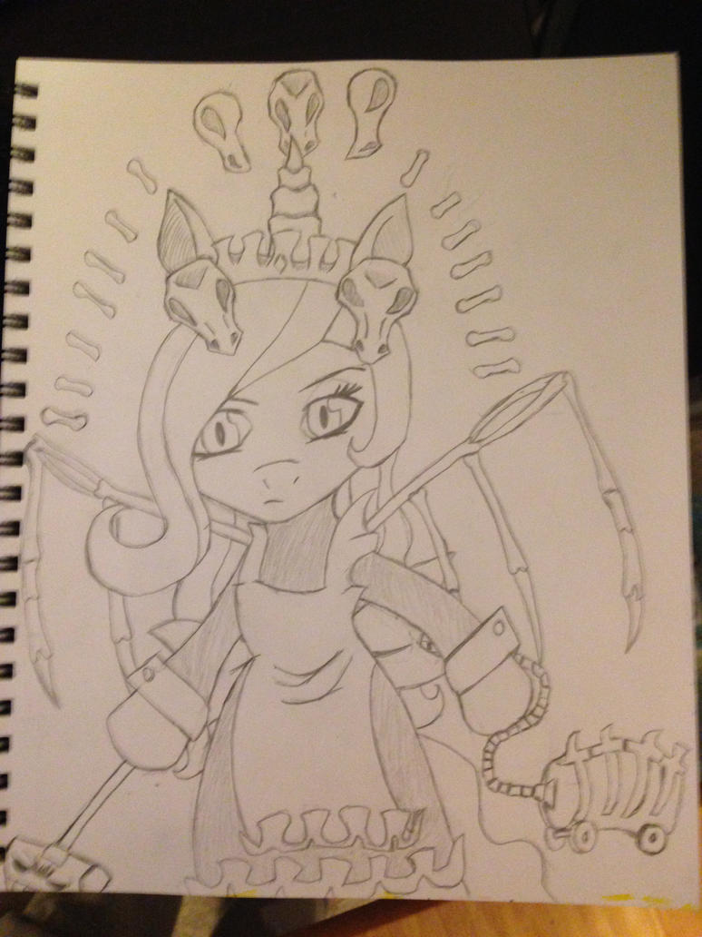
cellie__marie___celestia__skull_girls_mlp_cross_by_rukariotrainer-d9n9bol.jpg

Well.. it's probably not the worst programmer art you've ever seen. (I study computer science and game programming.. so... )
 
Last edited:
  • Like
Reactions: Fumako
That's, uh, definitely something.
Gonna be blunt here:
Your art, as of now, isn't particularly good. (Is this on deviant art)
BUT
There's something there. With a little bit of work, a little bit of elbow grease, I can see this really evolving into a genuinely unique and fun artsyle. What really caught me was the first squigly one; I don't usually like hard edges (I'm one of those who have trouble watching older anime) but I like that squigly (I'm ignoring the head on purpose). It's reminiscent of something else's style, but I can't quite put my finger on it.
OTHER THAN THAT "CHIBI" THINGY, YOU'VE GOT A LOT OF POTENTIAL. IF I COULD DRINK I WOULD BE DRINKING AFTER THOSE "CHIBIS" THOUGH.
I BELIEVE IN YOU, SO PLEASE DON'T LET WHATEVER MEAN THING I SAID DISCOURAGE YOU, THANKS

Never really watched past first season (I liked it, but then I got out of touch then the community drew me away) but isn't there some other pony you could've turned into Marie?
 
Well thank you for the feedback. I still do appreciate it. Sorry I made you want to drink, hehe. >_<
Yes I do have a DA that I put them on. The top two I put on around the same time I posted here. I also put a lot of older stuff up recently.. so going through the main folder is very varied (for artwork mostly look in the main folder. The other things are mostly photos or crafts and such). Here it is if you wanted to see it: http://rukariotrainer.deviantart.com/
What was it you liked about the non-"chibi" Squiggly picture? I guess it's interesting to hear/find out.
 
What was it you liked about the non-"chibi" Squiggly picture?
I don't really know :v
It might be weird, but I legitimately don't know.
It's just one of those things, you know? You're browsing something then suddenly you stop, you backtrack, then you linger on this one thing; you shouldn't really like it but it somehow holds you attention.
If I had to compare it to something it's like when I'm reading manga and OH GOD THIS IS HORRIBLE SHOUJO I'VE LITERALLY SEEN THIS STORY A BILLION TIMES but I keep reading because I can't stop grinning between the groans. It's like that, I've seen stuff similar to this on deviant art :shudder: but it's got a sort of charm to it that just draws me to it.
 
Well thanks for telling me and trying to explain. From the sounds of that I guess you hate DA. I haven't had trouble with it, but don't like social media in general. I avoid Face Book and Twitter and such so I'm guessing the feeling may be similar. Also I dislike shoujo as well. hehe. : ) (I know you weren't saying you dislike all, but I take it you dislike the standard shoujo stories, which are also probably the worse for me.)
Anyway I'll post other things if I make them.. though it may be more characters in the chibi-ish style (because I sort of want to try finishing that). Still though i may try other things.
Do you have something you'd like me to try? Some character in some style? Feel free to ask I can see how it goes. That said .. I generally kind of stick to super stylized unrealistic things if I have to draw more than just a head.. I can't really do anatomy. >_< Still, as I said feel free to give an assignment if you want ;p It could be fun to try... If not that's cool too, just an idea.
 
Alright so far, I like your blocky style. That third one is pretty unholy though.
Thanks for the response. It's neat to see different opinions. Glad you liked some of them.
Also when you say the third one is pretty unholy do you mean because it's a cross between a Skull Girl's character and an MLP character or do you mean the drawing itself? I'm guessing the second, but just asking. If you have anything specific to point out that bothered you that could be cool. : ) If not that's fine too. Sorry it was painful to see ;p
 
Also I dislike shoujo as well. hehe. : ) (I know you weren't saying you dislike all, but I take it you dislike the standard shoujo stories, which are also probably the worse for me.)
oh nonononono
you definitely misinterpreted it.
Shoujo manga is a passion. It's unapologetic schlock and I love it for that.
True story, I was going through my backlog and I had 2 shoujo oneshots right next to each other; the video I was listening to in the background finished so I went to youtube, got another video, then went back to my shoujos. 10 minutes later, after finishing it, when I was booted back to the page with the synopsis and stuffs I realised: I switched between the two without realising.
tl;dr shoujo is a super saturated genre with art-styles, stories, and characters so similar that I didn't realise I had switched.
(SERIOUSLY, everything between the two was THE SAME; the same events, the same framing, the same characters; THE ONLY THING THAT CHANGED WAS NAMES.)
But man, when shoujo gets it right IT GETS IT RIGHT.
From the sounds of that I guess you hate DA.
I liked it as a kid.
Having grown up and looking back it's a swarm of bad fan fiction and bad art.
How did I endure it, I have no idea; but it changed my life FOREVER.
though it may be more characters in the chibi-ish style
Oh god, please improve your "chibis"
They're less like chibis and more like pentagons with heads. (minus the parasoul one)
That said .. I generally kind of stick to super stylized unrealistic things if I have to draw more than just a head.. I can't really do anatomy.
Oh man, here's some stuff I guess:
The closest thing I can probably draw parallels on your art-style with is chickenwithtie's, check out her art thread if you haven't it's super stylised and I think learning a bit of how she does things would help your style grow.
edit: I don't know how I came to the conclusion of chickenwithtie but still, check her out. I think it was because I remember some pieces with hard edges.
Do you have something you'd like me to try?
I don't know how well it'd mash with your style, but I love works where it's just 2 solid colours; sorta like the entire thing is just light and shadow.
Maybe try something more minimalistic.
If you're going to try shading in the near future I'd recommend the mangas "Mozuya-san Gyakujousuru" and "Debu to Bijin."
Aside from both being the best mangas I've ever read they've also got, in my opinion, the best shading.
Mozuya-san has a more stylised artstyle; Debu to Bijin has more of a realistic look.
Well, shading is good, but their black and white colouring is also top-notch and something to see.
 
  • Like
Reactions: KiokuChan
You really should work on your proportion. They are REALLY off.

Even with your "unrealistic" style, it really doesn't look good in the eye. You really should study more in to how body structure works. If you want to draw a person, learning how body work is first step you have to take.

Anyway, keep drawing.
 
good that you're drawing! I love it when people draw or are in the process of learning.
It looks good! But i'd suggest putting more curves into your artwork and look at pictures of people/artwork of other artists with a more semi-realistic art style (Alex Ahad perhaps.) It's important that when you look at photos/pictures of humans you focus on not only their forms but the proportions too.

Oh man, here's some stuff I guess:
The closest thing I can probably draw parallels on your art-style with is chickenwithtie's, check out her art thread if you haven't it's super stylised and I think learning a bit of how she does things would help your style grow.
You shouldn't do that as they managed to draw in a certain way where they know how proportions work within their art style and how our eyes can just accept the anatomy/proportions. Your eyes aren't trained yet when it comes to drawing/analyzing so i really suggest looking up some refs on deviantart. I have a folder myself with a bunch of pose references so i can practice proportions and anatomy.

If you're interested you can find it here. I suggest reffing from a photo once a week, preferably static poses like a person standing so you can understand where the upper leg ends and a persons facial structures.
Really, don't get yourself down by the critiques, it's all about enjoying your art and improving it so you (important) can identify with it.

Here is me quoting a very very important post by Rose Morgan:

The methodological order of learning the basics:


  • Forms and shapes
    • They make up literally everything. You can be good at anatomy and perspective but still draw things very flat looking because you lack understanding of how forms and shapes work.
  • Perspective
    • Drawing forms and shapes in different perspectives helps you understand perspective in a more simple way. Start with them, then move onto more complicated shapes.
  • Composition
    • Draw the forms and shapes in different arrangements, orders, etc. Research different compositional arrangements and their effects.
  • Colour theory
    • Learn it and learn it well; then apply on all the above basics. Colour theory also includes lighting.
    • (I suggest doing this AS LAST since you should start learning how to draw shapes first, I used to be extremely inspired by Squeedgemonster, who used wonderful colors.)
  • Anatomy
    • Anatomy of all forms are comprised of a series of forms and shapes, so it’s imperative you understand them first before moving on to anatomy.
    • Anatomy doesn’t need to be done last; it can be done between forms and shapes and perspective, but it can be daunting for new artists so I usually leave it until last since it is a rather complex subject.
Reference, reference, reference

Draw from your imagination but always use references. It is not cheating. Every professional artist uses references. You cannot rely on remembering exactly how things look; your mind erroneously fills in the blanks for you.

Make sure you research the copyright restrictions on the images you use for reference if submitted anywhere. Give credit where credit is required, and when in doubt always ask the artist first. Master studies should always have credit given, even if the artist died hundreds of years ago. For quick reference checks like seeing what way a belt buckle goes, google image does the trick and no need to give credit there for something so small.

If you need any help with your art don't be shy and hit me up! I still have some really old pieces in my computer folder from waaaaaaaaaaaaay back and looking back at it, i'm very glad i took the chance to improve.
 
You shouldn't do that as they managed to draw in a certain way where they know how proportions work within their art style and how our eyes can just accept the anatomy/proportions.
I was just trying to say that there was some sort of similarity between some of chicken's pieces and his/her's and that there could be some crossover there in the "I have trouble with this part... let's try to see what this person with a similar style did and use that." Think having problem with combo crafting so you go to a combo thread to see what you can do, then having to take those strings and modifying them to be more comfortable for yourself.
This was what I did back when I was still trying to learn how to draw, before my self-perfectionism gnawed at me to the point of depression.
I understand where you're coming from, though. ^-^"
 
  • Like
Reactions: Sinclair
Thanks for all the responses. Fumako, thank you for carefully replying to everything I asked. : ) Not with SG characters, but I have tried something closer to typical chibi before. I was trying something different here, but I guess it didn't work. (I'm not saying the typical chibi style was better though, hehe >_< )

Mozuya-san has a more stylised artstyle; Debu to Bijin has more of a realistic look.
Well, shading is good, but their black and white colouring is also top-notch and something to see.

Thanks for suggesting things to look at!!

You really should work on your proportion. They are REALLY off.

Even with your "unrealistic" style, it really doesn't look good in the eye. You really should study more in to how body structure works. If you want to draw a person, learning how body work is first step you have to take.

Anyway, keep drawing.
Thank you as well for your advise and encouragement.

If you need any help with your art don't be shy and hit me up! I still have some really old pieces in my computer folder from waaaaaaaaaaaaay back and looking back at it, i'm very glad i took the chance to improve.
I really appreciate that you wrote out such a long quote with references and specific advice! That was very nice of you! ^__^

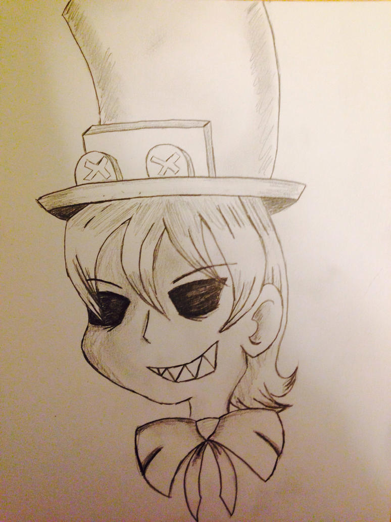
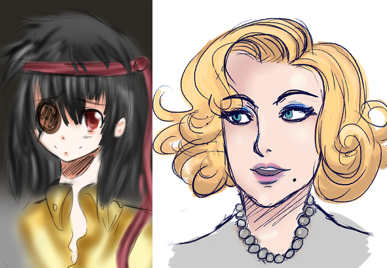
Here are 2 I just drew up in other styles I try some times, maybe you'll like them more. First I have an anime-ish style head shot of Peacock (I really can't even begin to draw full bodies in this style). I know it's kind of unusual to do the anime eye shape for a character who's eyes have been gauged out.. but that said that's soemthing you don't often run into either way...
Here is a full body picture of Peacock in a style somewhat inspired by nightmare before Christmas:
 
Last edited:
The first Peacock is good, albeit the mouth is a bit far the side, but its still pretty good.

The second, however, is...well...Needs work. The perspective feels off and the lack of detail on her arms make them look awkward. I think it could have benefitted from more shading outside the hair. Again, the head is the best part as it actually looks fairly cool from that side angle.
 
Honestly I'm going to be blunt, your art really needs work. I see your trying to copy artsyles instead of making your own. I recommend just practicing drawing real people, spend a session drawing certain body parts. Practice proportions that way you can develop your own artstyle. Like north said the second peacock is rough.
 
  • Like
Reactions: Fumako and Sinclair
Honestly I'm going to be blunt, your art really needs work. I see your trying to copy artsyles instead of making your own. I recommend just practicing drawing real people, spend a session drawing certain body parts. Practice proportions that way you can develop your own artstyle. Like north said the second peacock is rough.

The first Peacock is good, albeit the mouth is a bit far the side, but its still pretty good.

The second, however, is...well...Needs work. The perspective feels off and the lack of detail on her arms make them look awkward. I think it could have benefitted from more shading outside the hair. Again, the head is the best part as it actually looks fairly cool from that side angle.

Thank you both for the feedback and trying to help.

Something I just thought of writting that people may find interesting, or may not. Part of the reason I like trying to draw characters in the style of different cartoons and movies and stuff (to the extent I can) isn't only because I'm afraid to face realistic anatomy. It's also because I really like sets and groupings, and seeing how one group can get translated/represented in another unrelated group. I don't know if that makes sense but for example if someone took the five elements of Taoism and tried to bake a cake to symbolize each, even though I'm not Taoist and am not hugely interested in baking I would still find that really cool since I'd like to see how each of these object gets reflected in something that doesn't directly tie to it. For the same reason I like to think about what characters look like translated into styles different from there own (especially if it's a style I associate with other things) even if I'm not the best at successfully making that translation. Still I do understand what people are saying about not relying on others' styles, I'm just trying to explain why it is interesting to me. I don't know if that really made sense though, but hopefully it did.

-edit- gah I noticed that in my first post where I tried saying "I know it's not particularly good" I missed the not. I'm sure I thought it but just skipped the word while typing. It's not the worst typo I've made.... >_<

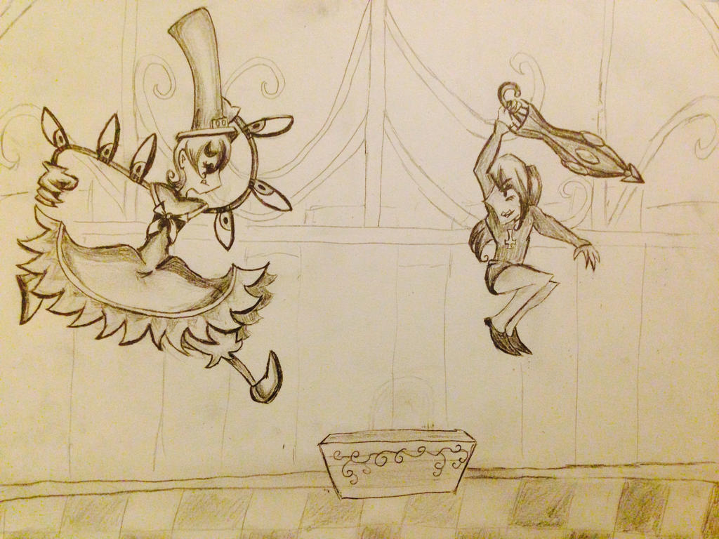
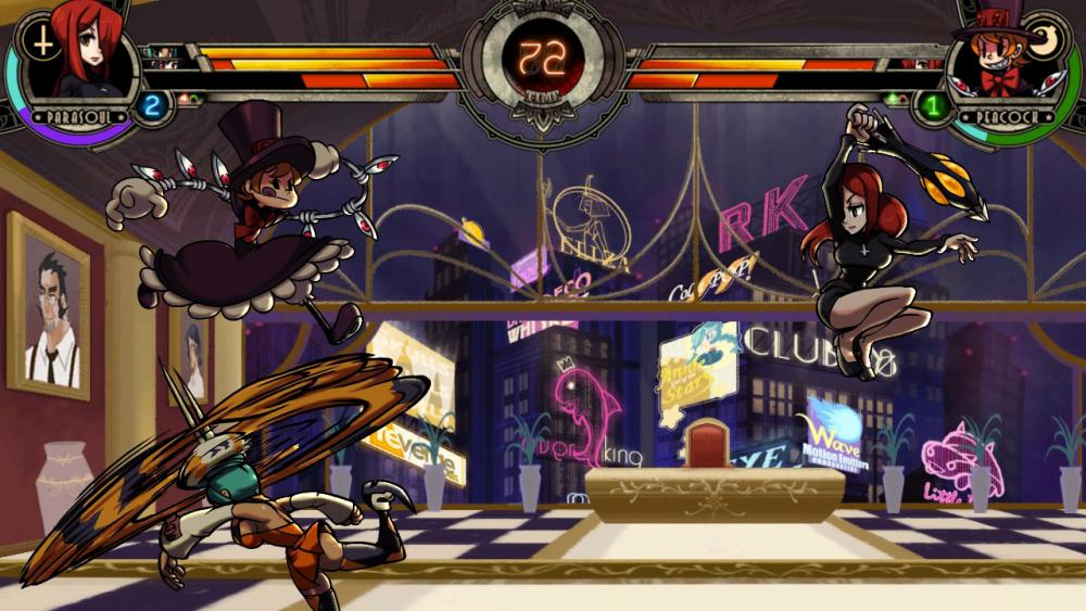
Also the thing I wrote a bit ago made me want to try at least one more SG picture in the last style I posted. It's based on a screen cap (minus one charcter and most of the background elements). I did try to shade more and make the arms a little more detailed like people wanted.. but you still may find it worse. I'm sure you are all going to hate this, sorry... >__< I at least enjoy it though.... hehe.

skullgirls_screencap_insired_picture__stylized__by_rukariotrainer-d9ohyvg.jpg


and here is the screenshot I was looking at:
343373_skullgirls_05_medium.jpg
 
Last edited:
  • Like
Reactions: Sinclair
Nah, its actually pretty good. The only thing is that Parasoul feels super small compared to Peacock here. Not like she's reducing her body while moving, just outright shrunk. Also her head is kinda big with no shoulders or neck visible, unlike the pick you put there.

Something I would suggest is learning more about drawing a 3D space. Your characters here have SOME depth, such as Parasoul's legs, but a lot of times the proportions are quite off compared to other things. Additionally, the Peacock's chest is pointing flat forward in yours as opposed to aimed towards Parasoul. Makes it look like she's jumping up and looking to the side.

I see potential. Wanting to do work in other styles is fine, but you have to kind of develop your own style (Which seems to be evolving already) before you can understand how you really draw and work to actively change that.

For example, in my own spritework I do, I know I tend to make proportions more flat and use less pixels, making it more like a pseudo 16-bit sprite that's kinda lacking in detail. Because of this, I can take other styles, like Mega Man Battle Network, for example, and copy it, purposefully excueing what I know to be my habits and style choices in favor of what the other brings. I don't quite think you're at that point yourself, yet.

Don't confuse this for me thinking its bad. The Peacock is actually REALLY good. I'm just one to always have a good piece of criticism for everything good there is ever (which is why all my art friends hate me)
 
  • Like
Reactions: KiokuChan
Nah, its actually pretty good. The only thing is that Parasoul feels super small compared to Peacock here. Not like she's reducing her body while moving, just outright shrunk. Also her head is kinda big with no shoulders or neck visible, unlike the pick you put there.

Something I would suggest is learning more about drawing a 3D space. Your characters here have SOME depth, such as Parasoul's legs, but a lot of times the proportions are quite off compared to other things. Additionally, the Peacock's chest is pointing flat forward in yours as opposed to aimed towards Parasoul. Makes it look like she's jumping up and looking to the side.

I see potential. Wanting to do work in other styles is fine, but you have to kind of develop your own style (Which seems to be evolving already) before you can understand how you really draw and work to actively change that.

For example, in my own spritework I do, I know I tend to make proportions more flat and use less pixels, making it more like a pseudo 16-bit sprite that's kinda lacking in detail. Because of this, I can take other styles, like Mega Man Battle Network, for example, and copy it, purposefully excueing what I know to be my habits and style choices in favor of what the other brings. I don't quite think you're at that point yourself, yet.

Don't confuse this for me thinking its bad. The Peacock is actually REALLY good. I'm just one to always have a good piece of criticism for everything good there is ever (which is why all my art friends hate me)
Thank you very much! I didn't really expect that positive response, and do appreciate the criticism. You are right that Parasoul is too small. I'm really bad at controlling proportions and handling perspective.. hehe. Still, I'm glad you liked how Peacock turned out overall in that picture : )
 
I also think the peacock's pretty good!
The use of curves and all makes it an interesting piece; more work in this weird style would actually be pretty interesting~
Additionally, the Peacock's chest is pointing flat forward in yours as opposed to aimed towards Parasoul. Makes it look like she's jumping up and looking to the side.
^This.
Don't have time to double check, but you seem to have some trouble drawing objects (Or representing it as thus) in an angle that is not straight forward, or straight sideways.
Case in point, the body is straight forward, but the legs are straight to the right. ^-^ (I originally meant this just for peacock, but on a second look it also applies to parasoul.)
PROBABLY NOT THE STYLE YOU'RE GOING FOR but I actually find this sort of visually interesting.
I'm really bad at controlling proportions and handling perspective..
Bluntly: yeah, you've definitely have to improve your perspectives, or, at the very least, improve depth and the scaling that that entails.
Also, if you're thinking you have to go for more realistic proportions: you don't. Weird, bizarre proportions done right are generally more visually interesting than "generic anime" or "generic cartoon/comic" proportions.
I'm just one to always have a good piece of criticism for everything good there is ever (which is why all my art friends hate me)
I'm just glad your art friends aren't game developers because I've had enough of developers throwing a tantrum against good criticism.
 
  • Like
Reactions: KiokuChan
Alright. Let me start out by saying you have potential. There is definitely something to how you draw that, if it had HARD WORK and TIME put into it, I could see really evolving into something cool and unique. Right now it's in its infancy, and has yet to be developed, but it's there.

(This is gonna be a HUGE POST)

Now the first thing I notice about your art is lack of proportion and weak poses. Lets look at that Parasoul/ Peacock drawing and compare it to the professional artwork in the screenshot (critique and image are in the following spoiler):

Critique.png

Now, I've added a few notations to the images. First thing I did, was add those magenta lines in the middle of the characters, this is the LINE OF ACTION. It serves as a character's spine, and it's shape helps to determine their pose, and also helps with placement of the rest of the body. A strong line of action will SERIOUSLY help with posing, it'll keep the characters from appearing stiff and oddly angled and will add alot of drama and flair to poses.

Now, look at the lines of action in your drawing, See how stick-straight and rigid they look? Compare it to the screen shot. We can clearly see where they are, and how they help with the characters poses. They also have natural looking curves to them.

Next, the deep blue lines on Peacock's legs. Again, in your drawing, they're rigid like yard sticks, at least they appear that way given the angle and placement of her feet. In the screen shot it's clear that her legs are curving naturally to convey she's in the middle of a run cycle. (The legs are almost never stick straight when running.)

Now, in hi-liter green I noted the strangeness of the scale of the characters in relation to one another. Parasoul has a giant face and shrunken body, while Peacock looks to be Big Band sized. Proportioning and doing a preliminary layout can seriously help alleviate scale issues.

Next, the red arrows. In your drawing I've drawn arrows to point in the direction Peacock's legs, torso and face are facing. See how all over the place her body parts are, direction wise? Her face and legs are on a totally 2D horizontal plain, while the torso is turned dead center at the viewer, causing inconsistencies in her body. In the screenie, We can see that all of Peacock's body is facing the same direction: towards her opponent, which is what you wanna do when you're fighting someone...face them.

Then, the red lines on the floor I added to demonstrate perspective. In your drawing, the tiles of the floor are all totally vertical, and appear like they're a wall continuing down. The red lines show that an objects shape can be greatly skewed depending on its distance and angle thanks to perspective. Parts of the object that are nearer are larger, and farther away parts are smaller.

Lastly I added yellow arrows to call attention to the action Cerabella is performing. Not only is her leading arm being thrown forward, but as a complimentary secondary action, her other arm is being pulled backwards, which makes it look like alot more power was put into the action she just did. Not only that, it'd help her keep her balance.
And I also drew a circle around your Parasoul's arm, as it looks tiny and short. There's very little in the way of foreshortening here, which causes this.

ONE LAST THING: Framing. Look at the screenie. See how theres something going on in almost every part of the shot, and how nicely centered the characters are? Now look at your drawing. There's alot of blank space behind Parasoul. Better centering would help.

Now, I'll try to help you with proportioning:

skeleton squig.png

I drew Squigs for ya. Now, from left to right: first I started with a very basic stick figure, or skeleton as I call it, with sticks representing limbs, and circles and blobs representing major body parts: Head, Torso, Joints, Hips, Hands and Feet. Also note the cross on her head, that helps to denote what direction her head is turned in 3 dimensions.

Next, I block out the rough shapes and masses of her body (and Levi) in light blue over the skeleton. Here we get a sense of what the final drawing will look like. NOTE THE LINE OF ACTION (her spine) it tells me what her overall body shape will be. Also keep in mind spines are curved, NEVER completely straight.

Finally, I do the final outlining, closely following (but not EXACTLY, feel free to make necessary changes, as I did here) the roughs underneath. This is when we add in details like hair, eyes, fingers, and clothing details.

I really want to stress HOW IMPORTANT THIS IS. For the longest time I refused to pre-plan my drawings and just free handed. They looked like ass. Poses were wonky, proportions were terrible and perspectives were skewed. When I finally swallowed my pride and started pre-planning my drawings my art improved DRASTICALLY. This helps keep your characters consistent between drawings, in both their look and proportions.

One last note: I am not telling you to follow my exact process, find what works for you and do that. I'm just showing you what works for me, to give you ideas.

Now, finally I wanna talk about poses:

posehelp.png


Here's an action pose I drew for you of Squiggs doing an attack like you might see in game (a palm strike followed by Levi doing a flame thrower type thing). I apologize if it's cluttered but I wanted the process to be visible.

First: LINE OF ACTION is hi-lited in bright magenta (with an arrow pointing to it) so you can see it easier. That's the first thing I draw. Then I overlay all the other junk like I just demonstrated.
See how it curves with her and her body naturally follows it? Look at how she's putting not just her arm, but HER ENTIRE BODY into that strike. Imagine this is her new s.HP. She really wants to slam her opponent away, and burn them in the process, so she's gonna use her legs, her back, her arm, and her body weight to really sock it to 'em.
Also note how all of the things hanging freely from her (the ends of her dress, her hair, her big loose sleeves) are being thrown back in the direction opposite of her strike. This makes it look like she slammed her hand forward so hard that those free hanging items got pushed back by the air. Things like this help increase the drama and power of action poses.

Now please understand, I am NOT telling you to draw like me. These are general things I've learned over the years that I wanna use to help you improve. I wanna see your future drawings and see how you improve. I did this not to insult you but to help. I like your drawings, your style just needs developing and you need to PRACTICE PRACTICE PRACTICE.

I hope I helped somewhat. Keep it up!

EDIT: Looking back on this I can already see some mistakes I made. For example Squigly's back should be more arched in her action pose to more closely follow her LINE OF ACTION, but hey, I learn new stuff every day. Learning from mistakes is the key to getting better.
 
Last edited:
Don't have time to double check, but you seem to have some trouble drawing objects (Or representing it as thus) in an angle that is not straight forward, or straight sideways.
Case in point, the body is straight forward, but the legs are straight to the right. ^-^ (I originally meant this just for peacock, but on a second look it also applies to parasoul.)
PROBABLY NOT THE STYLE YOU'RE GOING FOR but I actually find this sort of visually interesting.
Bluntly: yeah, you've definitely have to improve your perspectives, or, at the very least, improve depth and the scaling that that entails.
Also, if you're thinking you have to go for more realistic proportions: you don't. Weird, bizarre proportions done right are generally more visually interesting than "generic anime" or "generic cartoon/comic" proportions.
I'm glad you actually liked it for the most part. I think you are right that I don't know how to draw things that are turning or facing partially in a direction. Thank you for pointing it out. Handling depth, figuring out how things look from different angles, and having objects end up at decent relevant sizes is definitely a challenge. I'm also suspect I have a particularly bad visual memory (It's somewhat hard for me to recognize people I don't know particularly well and I get lost easily) so that probably doesn't help. hehe. I know though that that's all the more reason to try to observe things more frequently and pay more attention to objects and space. Thanks again for your help and feedback. It's nice that people want to help out.. and really I'm not sure I've ever gotten detailed responses to trying to show people artwork before, so that's pretty cool.

Alright. Let me start out by saying you have potential. There is definitely something to how you draw that, if it had HARD WORK and TIME put into it, I could see really evolving into something cool and unique. Right now it's in its infancy, and has yet to be developed, but it's there.

(This is gonna be a HUGE POST)
Thank you so much for huge informational post. That was really cool, and definitely mentioned some things I wouldn't have thought of. I'm not sure how good I'd be at being aware of certain things, but it definitely gives some things to try. I again really appreciate all the information and the fact that you illustrated what you were talking about. I think I'll try another picture based on a screen cap and see if this one goes better : ) Additionally I wanted to say that the standing Squiggly looked adorable and the fighting pose looked awesome! Your style is really cool and you are great at conveying actions. I know it's not the point, but do you have a DA I can look at? Hehe. Also it's nice to hear that you want to see if I get better!

--edit--

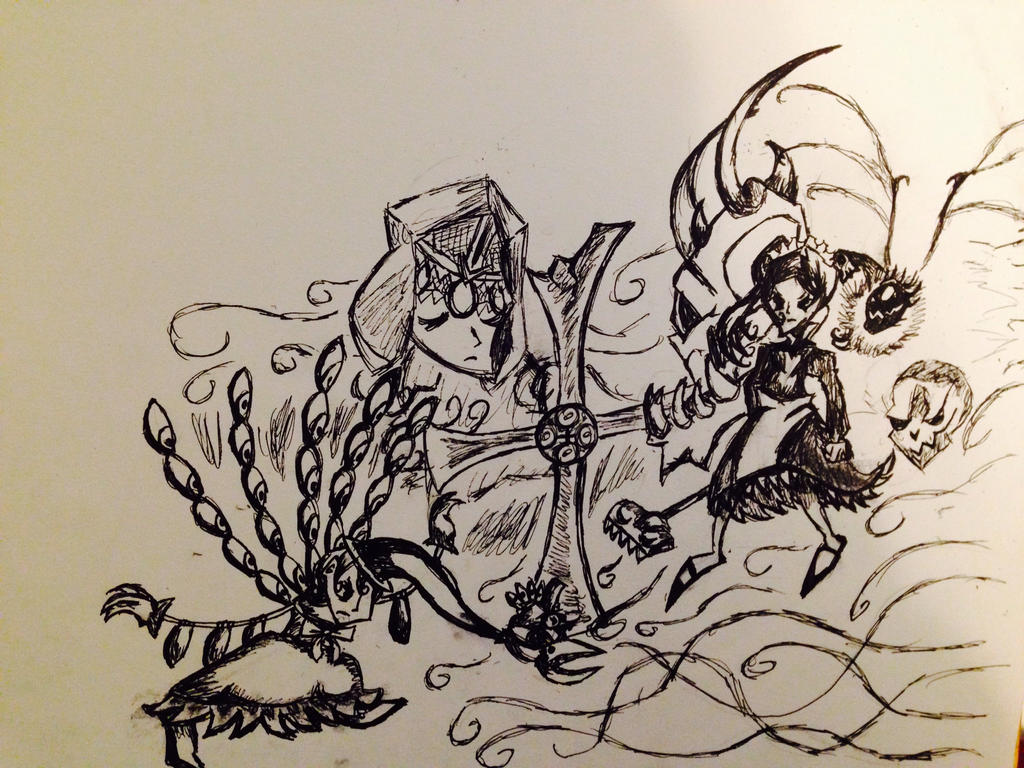
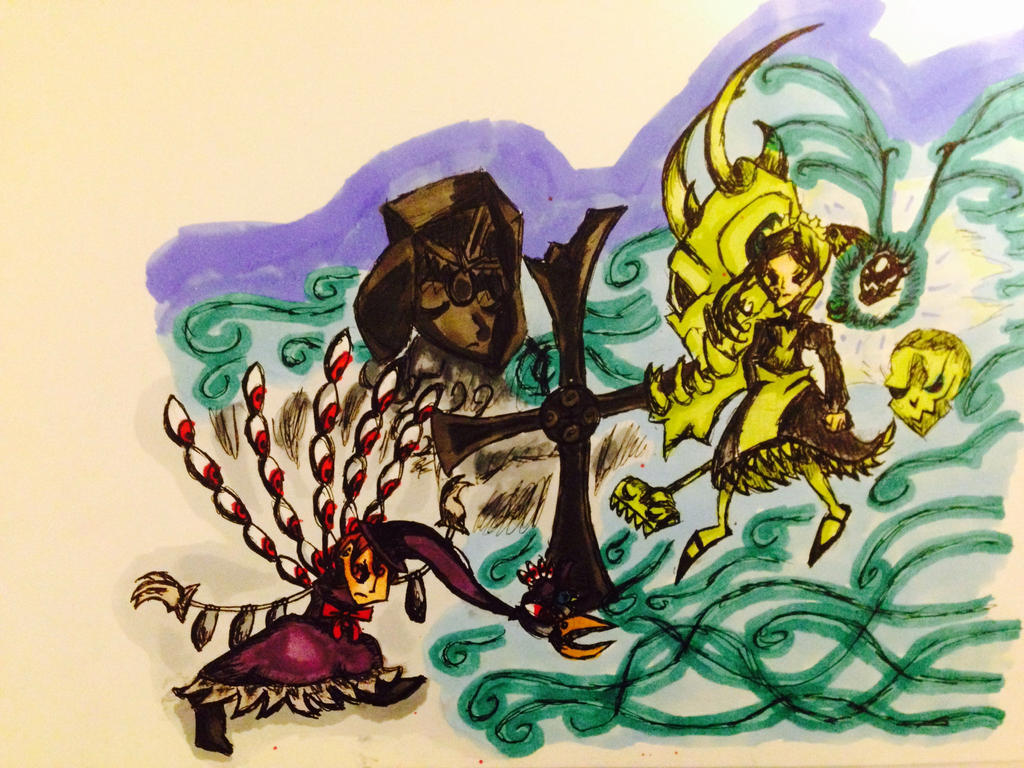
Well... thank you. I dedicate this to guypercinn so hopefully you like it better ;p I wasn't sure how to use such a sketchy style over the outline lines and ultimately be able to erase them, but decided I'd attempt doing the actual drawing part in pen . That of course made shading trickier and the whole thing look a bit blurrier (possibly making ceratin mistakes harder to see ;pp ) but I think this is neat. I once again redrew a printscreen from the game in that same style, with some changes to the scene. I have the characters closer together than in the orignal image. I also don't have all elements but managed to get in Marie, a few of her Undead army skeletons, the skull heart, Peacock with the argus unit ready to fire (but not starting to like in the picture), Avery (though hard to see), the cross in the background, and the head of Aeon's statue. If nothing else it's the most detailed thing I posted. Hope you find it cool too.. I also hope it's not TOO blurry and sketchy. Maybe I can try coloring it at some point.. I don't know.
skullgirls_screencap_insired_picture2__stylized__by_rukariotrainer-d9oj275.jpg

and here is the screenshot I looked at
Skullgirls-large-13.jpg
 
Last edited:
You have something that I really like !

I'm not heavily skilled at drawing, I'm still learning for now, but if I can give you a good advice to progress, it's this one : take drawing lessons ! You don't have to spend to much money in this, take like 10 hours with a private teacher just to learn the basics and then, practice !
It's always good to learn with a professional who can follow your progression and advice you directly.

Of course, if you can't (or just don't want) to take lessons, there are tons of tuto and people who can help you on internet. But if a thing is certain, one of the most important thing is practice ! Other than that, I think everything you need to know has been said by the others.

If you need help, you can ask me too, but the other ones here seem to be way more experienced ! :)
I'm glad to hear you like it, and thank you very much! I also again appreciate the offer to help.

I colored the last picture now! I have some cool markers that I used : )
skullgirls_screencap_insired_pic2_color__stylized__by_rukariotrainer-d9ol4kk.jpg
that said I'm taking the pictures on an iphone... the colors look a bit odd on this. I can maybe try to scan things at some point but it will probably be a while before I can.
I do realize though that in mine Peacock looks less like she's going to fire at Marie and more like she's really tuckered out yet still trying to mange to brace herself for the oncoming wave of bio-luminescent tendrils and skeletons. I'm not sure what to do about that but find it neat anyway. At least, as far as I can tell, things are facing in a more reasonable directions and proportions are better than in the first fight scene. Let me know if I'm not correct there though. Hehe.
 
Last edited:
KiokuChan said:
I think I'll try another picture based on a screen cap and see if this one goes better

The drawing you did of Peacock and Marie is pretty cool, but again, Staging. Look at all the blank space on the top and bottom of the picture. It looks like you wanted to focus on the characters, so make them fill the page! Give our eyes something to look at on the whole page.

Also I wanted to say your style looks like it has a Tim Burton Nightmare Before Christmas/Invader Zim/ Johnny the Homicidal Maniac vibe to it. Develop it!

There are lots of very talented artists here on Skullheart who I'm sure would love to help you out. Don't be afraid to maybe even message someone to critique your stuff, they'd probably be flattered.

One more thing I wanted to say, do life drawing. Draw real environments, draw objects, draw REAL PEOPLE. I myself need to do this. Alll I draw are cartoons because I'm really not a fan of realism at all. But, me being so stubborn and narrow minded has limited my skill. Learning from real life will help your art, because art is based on real life. Cartoons are exaggerated versions of real human forms and figures. It'll help you understand people, animals, perspective, shading...everything.

If you really hate realistic drawing (like I do) find ways to make it fun. Find pictures of things you think are really cool and draw those. For example, I think machines, swords, Samurai, Knights and naked ladies are cool, so I focus on drawing things like that to make it enjoyable for me. But again, dont ONLY do that, you'll limit yourself. You have to be able to step out of your comfort zone, that's when you'll REALLY learn. Your style will come out of hiding and naturally develop the more you practice. If you looked at my drawings from 10 years ago, all I did was try to draw animu garbage. I tried for years until, when I was 15, I discovered that I like the look of Western Cartoons alot more, and it clicked. That's when my own style came into being and I began to seriously improve. I stepped out of my comfort zone and it paid off.

Also thanks for the compliment. And no I don't have a DA. I got reallyyyy fed up with that place. My stuff on there was shit anyhow.
 
  • Like
Reactions: Sinclair
I love how everyone is trying to help with "tips and tricks", but to be honest, that's not what he needs!
What he really needs is time. So so so much time. I started drawing yeeaaars ago, when i was still a little baby, and i mainly improved by doodling. I still doodle now, i doodle a lot.

@KiokuChan draw EVERY day. Literally, draw every darn day. DOODLE. I know people who haven't improved in 3 years because they're extremely nitpicky about their art, because they spend 5 hours on lineart and because they spend hooooooooours on sketching. Get messy, draw messy, like i do. I improved a lot in 2 years because i didn't spend my time worrying about "the finished result" of my art. There are times where i look at my art and i'm like "ugh i hate how the arm/hip/whatever looks like" but at least i can SEE what i've done wrong, and i'll have the chance to not make that mistake the next time i draw.

Seriously, keep doodling, keep drawing, don't be nitpicky and too "clean" when it comes to art. Especially since you're a beginner. You'll notice how much you'll improve in a few months. I used to only draw "serious" pieces and I never doodled, at some point i stagnated and didn't improve at all. Then i was like "f*ck it" and just started drawing without caring about how it looked like. I managed to create my own art style, improved my proportions and so much more because my mind wasn't stuck with one thing when it came to drawing.

I suggest, doodle every day and make a serious piece every month. Look at other artists arts: How do they draw? What shape do they give the legs? What makes everything look so good about that drawing/character.

Several things are important when you want to improve and for beginners its mostly:

  • Have fun
  • Train your eye to see mistakes
  • Try everything
And please remember, your art doesn't have to be perfect because it will never be perfect. I sometimes re-play SG storymodes and noticed a lot of mistakes in the art, but that's mostly because art can never be perfect.
I know so many people who quit art for a few months and stopped drawing because they couldn't perfect their art, because they couldn't master the art of drawing hands or because they hated their art style. I was one of them! and i ABSOLUTELY regret quitting art for several months (my biggest break WAS A YEAR) because I knew i couldn't draw like Squeedge and Ahad, but guess what! I didn't improve because I kept nitpicking my art, i kept spending HOURS maybe DAYS on 1 sketch because i wanted it to be perfect. I never doodled or anything because i thought being a great artist was becoming some kinda machine that shits out perfect full drawings.

I'm still learning shapes and forms and everything, but it's so so so so important to sometimes throw that shit aside and just focus on what you want to draw and how you want it to look like. And most importantly, have fun!

I suggest making sketch/doodle sheets, just fill out an entire canvas/paper with doodles! And like i said, it's ok to make full drawings but now that you're a beginner just focus on the little things. Don't start big or else it'll be 2 years later and you still can't draw a hand (like me wtf) because you spend so many days on drawing 1 piece of art.

If you want to know what 8 years of art does with u
001a89c421961521cc9914db0f0fb122.png

Its ok to make mistakes, and you should keep making them because thats the only way you'll learn!