• As part of the relaunch of Skullheart, ALL previous threads have been archived. You can find them at the bottom of the forum in the Archives (2021) section. The archives are locked, so please use the new forum sections to create new discussion threads.

What will happen to the character select screen?

the_rpg_king

Maid of Justice
Joined
Oct 19, 2015
Messages
316
Reaction score
205
Points
43
Age
29
Location
Mesa, AZ
Steam
KnockDownJoe
PSN
rpgking20
Unknown Robo Fortune Double
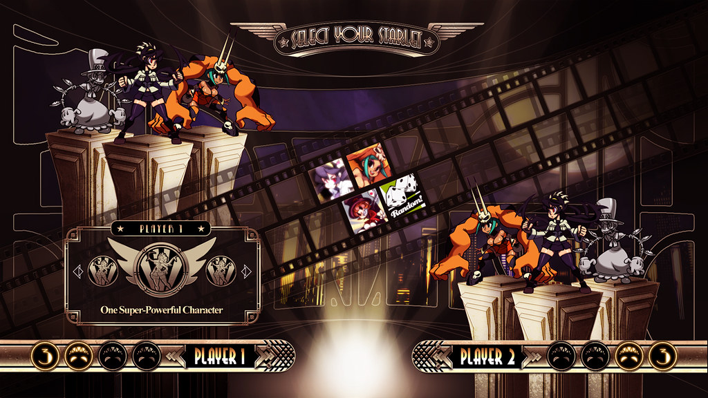
Now that 2nd Encore is getting more characters, something is concerning me. I was waiting for Umbrella's Alpha to drop so I can find out what the character select screen will look like and where Umbrella's portrait will fit. What will happen to the character select screen now that we are getting Annie, Umbrella and future characters?
 
Last edited:
They can just expand the char select UI to accommodate more characters lol. FYI this is what the pre-release char select screen looked like when there were less characters planned for the game.

5952567322_c3d18d9d7d_b.jpg
 
Since Umbrella's portrait is below Fukua's and before Annie's, the placement of the character select screen should look like this during the Season 1 Pass period to follow on Tekken 7, Soul Calibur VI and Granblue Fantasy Versus' footsteps. DLC Character 3's portrait below Robo-Fortune's and after Annie's, DLC Character 4's portrait above Squigly's and DLC Character 5's portrait above Eliza's if the Season 1 Pass sells well and its UI must be expanded to make room for the characters in the Season 2 Pass and beyond, like in Soul Calibur VI where the character select screen gets updated in Season 2.

Skullgirls 2nd Encore Character Select Screen Placement Prediction.png
 
Last edited:
I agree Marie, er, I mean, totally unknown new character #3, will go next to Annie.

But instead of expanding on the top level above Squigly and such, I think the three bottom cells below Umbrella could be used.

Long shot: UI designer Brady Hartel makes a new grid.
 
I agree Marie, er, I mean, totally unknown new character #3, will go next to Annie.

But instead of expanding on the top level above Squigly and such, I think the three bottom cells below Umbrella could be used.

Long shot: UI designer Brady Hartel makes a new grid.
The reason why I wanted DLC Characters 4 and 5's portrait to be above Squigly and Eliza is because they need to pay attention the Random character selection. If they put them below Umbrella and Annie, that will make it uneven. Also, Brady's making a new grid? I bet it's gonna be 5x9 with smaller squares to make room for the characters in the Season Pass 2 and beyond, huh?
 
  • Like
Reactions: BellaFeng4Eternity
Since I was told that Brady Hartel is making a new grid, this is what the new grid for the character select screen should look like for the Season 2 Pass period and beyond.

bandicam 2021-09-09 10-45-04-222.png


The random character selection is right in the middle of the grid. Has 23 "?" squares (preferrably the new characters in my wish list), 16 character portraits with a new placement; Annie's portrait above Big Band and Umbrella's portrait below Beowulf, 4 blank squares in the corners and one blank square above Annie where the online character select timer is located.
 
Since I was told that Brady Hartel is making a new grid, this is what the new grid for the character select screen should look like for the Season 2 Pass period and beyond.

View attachment 15952

The random character selection is right in the middle of the grid. Has 23 "?" squares (preferrably the new characters in my wish list), 16 character portraits with a new placement; Annie's portrait above Big Band and Umbrella's portrait below Beowulf, 4 blank squares in the corners and one blank square above Annie where the online character select timer is located.
I feel like this is the most accurate design for the character select when we reach Season 2 and onwards for Skullgirls.
 
Not opposed to expanding the screen for more characters if we get any past the first pass, but I've really come to enjoy the vertical layout. Compared to other fighting games I've played it's a lot easier on the eyes than selecting characters on a horizontal selection screen.
 
I just learned that the previous placement prediction for the character select screen for when all four Season 1 Pass characters did not turn out well, so I have a better placement prediction.

bandicam 2022-04-24 20-56-20-176.png


I know I said that Black Dahlia might be located below Robo-Fortune's and after Annie's, so the fourth Season 1 Pass character's portrait should be below Annie's portrait.
 
I just learned that the previous placement prediction for the character select screen for when all four Season 1 Pass characters did not turn out well, so I have a better placement prediction.

View attachment 16181

I know I said that Black Dahlia might be located below Robo-Fortune's and after Annie's, so the fourth Season 1 Pass character's portrait should be below Annie's portrait.
It would be fitting for Marie to be by herself on the bottom/top row (at least for now depending on if there are any more characters afterwards) seeing how she is the final boss and titular character.
 
Last edited:
  • Like
Reactions: BellaFeng4Eternity
Skullgirls' character select's default position starts at the random icon. Since we already have 3 rows below the default position and 2 rows above, I don't think they should add another row at the bottom. That's adding more average steps than necessary to get to the character you want. Either they should add DLC4 at the top, or they need to re-shuffle the positions so Random Select is back at the centre.

The latter option is likely not preferred as that's gonna change positions of some characters and some players will need to retrain their muscle memories to quickly pick the characters they want.
 
  • Like
Reactions: Ikkisoad
Skullgirls' character select's default position starts at the random icon. Since we already have 3 rows below the default position and 2 rows above, I don't think they should add another row at the bottom. That's adding more average steps than necessary to get to the character you want. Either they should add DLC4 at the top, or they need to re-shuffle the positions so Random Select is back at the centre.

The latter option is likely not preferred as that's gonna change positions of some characters and some players will need to retrain their muscle memories to quickly pick the characters they want.
Well, if DLC4 is Marie and she is at the top of Big Band, the online timer blocks her portrait and putting her on one of the two squares, one on each end above the default position makes it a bit weird, so they could either put her below Annie or move the 14 portraits and the random icon down by one square to put Annie, Umbrella and Black Dahlia above Squigly, Big Band and Eliza and put Marie below Beowulf. Or better yet, pull the film strip down by an inch and put Annie's above Squigly, Umbrella's above Eliza and Black Dahlia's below Beowulf.
 
Last edited:
Well, if DLC4 is Marie and she is at the top of Big Band, the online timer blocks her portrait and putting her on one of the two squares, one on each end above the default position makes it a bit weird, so they could either put her below Annie or move the 14 portraits and the random icon down by one square to put Annie, Umbrella and Black Dahlia above Squigly, Big Band and Eliza and put Marie below Beowulf. Or better yet, pull the film strip down by an inch and put Annie's above Squigly, Umbrella's above Eliza and Black Dahlia's below Beowulf.
Yep, my thought is also to shift everything down by 1 square (or less, they could just shift the background filmstrip down by a little bit). Everything in the same position just slightly lower.
 
Yep, my thought is also to shift everything down by 1 square (or less, they could just shift the background filmstrip down by a little bit). Everything in the same position just slightly lower.
In any case, if Black Dahlia's Alpha drops, they must pull the film strip down a bit and put Annie above Squigly, Umbrella above Eliza and Black Dahlia below Beowulf. But if DLC4's Alpha drops, they must put Black Dahlia below Fukua and DLC4 below Beowulf. That's gonna be my theory for the moment. I'm gonna find out if my theory is true once Black Dahlia enters Alpha.
 
Has anyone seen Dahlia's placement in the select screen? Below Robo Fortune?
 
Has anyone seen Dahlia's placement in the select screen? Below Robo Fortune?
I have. It turns out that Black Dahlia's portrait is actually located below Robo-Fortune. But it's fine.
 
It is actually perfect that Black Dahlia is located below Robo-Fortune and after Annie to fill out the bottom row and make a perfect rectangle. Now, where are they gonna put Marie at? Are they gonna move the portraits and the random character selection down by one square to put Annie, Umbrella and Black Dahlia above Squigly, Big Band and Eliza and put Marie below Beowulf? If her portrait is simply put below Annie, that could defeat the purpose. Maybe @Liam and the other devs might know, if they are online.

bandicam 2022-08-21 19-34-39-504.png
 
Last edited:
They can just expand the char select UI to accommodate more characters lol. FYI this is what the pre-release char select screen looked like when there were less characters planned for the game.

5952567322_c3d18d9d7d_b.jpg
I really feel like they should kept it this way. It really fits with the film-themed ui and stuff. This would fit all the characters this game has/will have if they decide to go back to this
 
I really feel like they should kept it this way. It really fits with the film-themed ui and stuff. This would fit all the characters this game has/will have if they decide to go back to this
Personally I'm not a fan of diagonal layouts, because of ambiguity on how the curser is supposed to move when you press a direction. (For example, if your cursor is highlighting Bella on that picture, do you know if you will go to Peacock or Random when you press down, at first glance?) I think the current grid is fine, just needs to be resized and/or recentred.

And the current UI still has the film theme lol, just rotated another way.
 
  • Like
Reactions: Holy Goose
Personally I'm not a fan of diagonal layouts, because of ambiguity on how the curser is supposed to move when you press a direction. (For example, if your cursor is highlighting Bella on that picture, do you know if you will go to Peacock or Random when you press down, at first glance?) I think the current grid is fine, just needs to be resized and/or recentred.

And the current UI still has the film theme lol, just rotated another way.
Yea I agree that would be an issue, but you could just tilt the stick diagonally or if you’re using the d-pad you could just go to peacock if you didn’t wanna pick random, if they do bring this back it’d be cool if you could choose if you wanted the diagonal or grid select screen.
 
I was waiting for Liam and the other devs to know what will happen to the CSS when Marie hits Alpha, but they seem to be quiet here. It appears that they are diligently working on Black Dahlia and that's good because working on new characters diligently is the key to releasing them sooner. Also, the film UI is interesting because you know, art deco? It made me think of the characters as celebrities.
 
Last edited:
I found out what happened to the character select screen in Them's Fightin' Herds as soon as Texas came out. Now I need to find out what will actually happen to the character select screen in Skullgirls as soon as Marie's Alpha phase drops.
 
Annie
SquiglyBig BandEliza
Ms. FortunePeacockPainwheel
FiliaRandomCerebella
ValentineParasoulDouble
FukuaBeowulfRobo-Fortune
UmbrellaBlack DahliaMarie
Online Timer

This is gonna be my prediction to what will the character select placement actually looks like when either Marie hits Alpha or when there is a change that matches my prediction above with the online timer being on the bottom to fit Annie's portrait on top during the general balance changes section, which I hope we get word about soon. What do you think of my prediction?
 
Skullgirls posted a video on Twitter showing us the actual placement of the character select screen that will take place during Marie's Alpha and beyond, but apparently, Marie's portrait is actually located above Big Band while Annie's portrait is still on the same spot, so my prediction to it is wrong. But the good news is that Marie being above Big Band is actually a perfect placement. This seals the deal that Marie is literally the cherry on top of the placement since she is the current Skullgirl and the final Season 1 Pass character and the Random selection is still in the center. Hey, @Chrono_Tata, this is what you wanted, right? You said that the Random selection needs to be centered and I actually agree with you and this is actually a good placement for the Random selection to stay centered.


But the best bet is that online timer needs to be located at the bottom of the selection and below Annie's portrait. You know, like in BlazBlue: Central Fiction that the timer appears at the bottom of the selection when Jubei came out because if it's at the top of the character select sign, the BETA tag can block it. Here's what the placement actually looks like when choosing your characters online.

Marie
SquiglyBig BandEliza
Ms. FortunePeacockPainwheel
FiliaRandomCerebella
ValentineParasoulDouble
FukuaBeowulfRobo-Fortune
UmbrellaAnnieBlack Dahlia
Online Timer
 
Last edited: