• As part of the relaunch of Skullheart, ALL previous threads have been archived. You can find them at the bottom of the forum in the Archives (2021) section. The archives are locked, so please use the new forum sections to create new discussion threads.

Project Annie...In Motion!

It's good to see that my Annie obsession hasn't scared people away from her, and has instead AMPLIFIED THEIR LOVE FOR HER.
Chemicalbonbonne (who needs to come back :,c) drew me to Annie. You frightened me like the free candy guy in chitty chitty bang bang. You know me as you know me DDB.
 
  • Like
Reactions: DDB
I know this may not be the most appropriate place to post this but I'n SO FING HYPE I don't care. THE DESIGN of this shirt is so gdlike. ANNIE HAS SO MUCH POTENTIAL. I got the red version b/c it makes the flames on her sword appear solid black.
 
Last edited:
Decided to spend a couple of hours tweaking my last animation cycle. Nothing new or special, as it's mostly the same. I just added a lot of secondary motion and little details that really help bring it to life.

AnnieAlternativeIdle2EditOpt.gif

I might do a walk cycle or something next, kinda feel like doing a little more animation stuff. Any suggestions for what would be good to animate?
 
Decided to spend a couple of hours tweaking my last animation cycle. Nothing new or special, as it's mostly the same. I just added a lot of secondary motion and little details that really help bring it to life.


I might do a walk cycle or something next, kinda feel like doing a little more animation stuff. Any suggestions for what would be good to animate?
This is really cool! Hmm... maybe a win pose for Annie?
 
concept.jpg
Here is a ton of stuff to choose from. I would try her dash or what looks like her dash (the one where she's riding Sagan like a scooter)
 
  • Like
Reactions: Kai
A win pose is a good idea. And a dash is a good idea as well because it would be really easy. Most of the running dashes in SG are fairly short loops.

Also that dash is hilarious lol
 
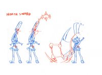
Just a thought: The North Sword is inconsistent. Isn't the four-star cluster supposed to be an extension of her sword? Why is the orientation all wrong in the downswing compared to her startup?
 
Here is a ton of stuff to choose from. I would try her dash or what looks like her dash (the one where she's riding Sagan like a scooter)

This is why I rooted for Annie. This is why I am still a member of team Star☆Wulf.
 
Last edited:
  • Like
Reactions: Denizen and DDB
This is why I rooted for Annie. This is why I am still a member of team StarWulf.
Mind if I ask what StarWulf is? The only thing that comes to mind is StarFox.
 
Mind if I ask what StarWulf is? The only thing that comes to mind is StarFox.

Back in the days of the Waifu Wars people who wanted both Annie and Beowulf were called members of team Star☆Wulf. You could call the actual outcome of the voting BloodWulf for Eliza and Beowulf though. There was no cutesy little name for Squigs and BB, or Robo-Fortune. This is simply because they were characters that we, as members of the community, had no control in choosing.
 
Last edited:
Back in the days of the Waifu Wars people who wanted both Annie and Beowulf where called members of team Star☆Wulf. You could call the outcome of the voting Blood(Eliza) Wulf (Beowulf) though. There was no cutesy little name for Squigs and BB or Robo-Fortune simply because they were characters that we, as members of the community, had no control in choosing.
FTFY
 
Back in the days of the Voting Wars people who wanted both Annie and Beowulf where called members of team Star☆Wulf. You could call the outcome of the voting Blood(Eliza) Wulf (Beowulf) though. There was no cutesy little name for Squigs and BB or Robo-Fortune simply because they were characters that we, as members of the community, had no control in choosing.
Ooooh. That makes more sense, thanks for clearing that up for me.
 
  • Like
Reactions: DDB
Just a thought: The North Sword is inconsistent. Isn't the four-star cluster supposed to be an extension of her sword? Why is the orientation all wrong in the downswing compared to her startup?

The orientation is the same in both versions. What you're seeing in the illustration of the downswing is a smear. It's illustrated in such a manner to convey her action (in this case, the motion of her swinging the sword down very quickly). There are a lot of frames of animation like this in SG and it's a traditional animation technique.
 
  • Like
Reactions: DDB
The orientation is the same in both versions.
I think he's talking about where the four square cluster is in relation to the sword, when she holds it above her head the stars lead to the square and the sword doesn't touch the four square cluster.
When she swings the sword down the four square cluster is touching the sword and the lined stars lead away from it.

Maybe like this? I could be way off though.
BMaJIcy.jpg
I still think it looks better the other way though, it makes more sense for hitboxes too.
If it were to be the same then I think the four star cluster should be touching the sword.
 
#PutTheMainCharacterInSkullgirls
 
  • Like
Reactions: DDB
I think he's talking about where the four square cluster is in relation to the sword, when she holds it above her head the stars lead to the square and the sword doesn't touch the four square cluster.
When she swings the sword down the four square cluster is touching the sword and the lined stars lead away from it.
Yeah, that. In startup, the five-star line's flush to the sword, the first star on the hilt. On swing, the first star's still on the hilt, but the rest of the formation is turned.
 
Fixed that for you?
I didn't understand what he fixed. I know the acronym. But I digress, no need to derail a thread over something miniscule.
 
I think he's talking about where the four square cluster is in relation to the sword, when she holds it above her head the stars lead to the square and the sword doesn't touch the four square cluster.
When she swings the sword down the four square cluster is touching the sword and the lined stars lead away from it.

Maybe like this? I could be way off though.
BMaJIcy.jpg
I still think it looks better the other way though, it makes more sense for hitboxes too.
If it were to be the same then I think the four star cluster should be touching the sword.

Yeah, that. In startup, the five-star line's flush to the sword, the first star on the hilt. On swing, the first star's still on the hilt, but the rest of the formation is turned.

Again, I understand why you guys are confused about the illustration but you're still wrong on this one.

Here's an illustration explaining why...

Smear.jpg

Like I said before, this is called a smear. It's simply a technique employed in animation to convey movement in a single frame. Those extra red diamonds aren't physically "there," they represent a light trail that was left behind as she swings downward.
 
Again, I understand why you guys are confused about the illustration but you're still wrong on this one.

Here's an illustration explaining why...


Like I said before, this is called a smear. It's simply a technique employed in animation to convey movement in a single frame. Those extra red diamonds aren't physically "there," they represent a light trail that was left behind as she swings downward.
But that doesn't make much sense, though, if the original hilt glow is still there representing the first star. If it was smeared in a way where the five-star was still aligned with the sword, I wouldn't be as bother me as much. The way it's smeared now, there are EIGHT stars in the second frame instead of seven, which isn't consistent.

Edit: Didn't see Skarmand's attachment til now; totally NOT what I was going for.

Annie.jpg
 
Last edited:
But that doesn't make much sense, though, if the original hilt glow is still there representing the first star. If it was smeared in a way where the five-star was still aligned with the sword, I wouldn't be as bother me as much. The way it's smeared now, there are EIGHT stars in the second frame instead of seven, which isn't consistent.

Edit: Didn't see Skarmand's attachment til now; totally NOT what I was going for.

I think you're looking into this too much by counting the stars. This was a sketch of an idea for a move that was probably done in a matter of minutes to convey how the move works. Whoever sketched this probably didn't bother counting or paying attention to the order and placement of the stars because it doesn't matter.

It's really obvious that it's simply supposed to be a smear frame. Yes it's not completely accurate. The reason for this is because accuracy doesn't matter when you're sketching out quick ideas for moves. This is simply the kind of detail that would be fixed when the actual animation work begins.

Edit: I also forgot to mention that it's possible that the orientation is switched on purpose and was simply an error. For example, they may have simply not been thinking about the orientation in the first drawing and just kind of illustrated what first came to mind in the second pose without thinking too much on it. Again, it doesn't matter because we can tell how the move works, so don't look too much into it.
 
Check the spoiler above; that's what I meant. I get that it's supposed to be a smear frame, but I just don't see it as consistent.
 
Check the spoiler above; that's what I meant. I get that it's supposed to be a smear frame, but I just don't see it as consistent.

Yeah I see the inconsistency there and I'm sure it's a mistake, I'm just saying it doesn't matter. The illustration conveys how the move works regardless of how accurate it is. It's just a quick sketch.
 
  • Like
Reactions: Denizen
If you haven't decided yet, I think it would be awesome if you did and idle for her powered up mode (she has two eyes!!).
 
If you haven't decided yet, I think it would be awesome if you did and idle for her powered up mode (she has two eyes!!).

That actually would be really cool, I might do that one :)

I'll probably have to make up some details regarding her character design though, which I prefer not to do. Oh well, I'll figure something out.
 
  • Like
Reactions: DDB and CaioLugon
Before I make a decision...

Is there anything special that I don't know about season 2 Annie? I don't know anything beyond what she kind of looks like. Are her characteristics different, does her physical body change at all, or does she basically just change uniforms and start flyin' n shit?
 
She seems taller and with a more mature appearance, to me.
 
She seems taller and with a more mature appearance, to me.

That's what i'm wondering about...is she supposed to have an older body when she transforms?
 
I wouldn't say she gets any physical change just sagan becomes an outfit around her, the dress mimics the aurora borealis her hair is down, ect
 
So I sketched up a quick idea for what Season 2 Annie might be like and I need some feedback. I made some specific decisions of which need some critiquing. For example I decided to make her look older, therefore she is a decent bit taller and has a more mature face.

AnnieSeason2IdleOpt.jpg

Also I chose to illustrate part of her in color rather than line-work. The idea here is that the rim of her dress would be animated in a manner that would allow it to be masked out to look like a nebula without an outline. I also have her sword floating above her hand, just thought it might be kinda cool.

So what do you guys think? Should she look physically older or not? What about some of the more minor details?

I'd like to animate this, but I also don't want to go making decisions with regards to her character design because she's simply not my character. I have no idea what the purpose or intent behind her alternate form is and it's not my place to make those kinds of decisions. If you guys know about anything or have any thoughts it would be great to hear about it :)
 
Oh yeah, I was messing around and made a few of Annie's concept art pictures transparent.
http://imgur.com/a/4au1X
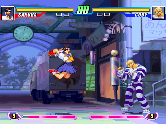
Hmm. After looking at this pic, I also want to see Annie do Sakura Otoshi.
J1ctap3.png

90752640.png
 
Last edited:
  • Like
Reactions: DDB