• As part of the relaunch of Skullheart, ALL previous threads have been archived. You can find them at the bottom of the forum in the Archives (2021) section. The archives are locked, so please use the new forum sections to create new discussion threads.

Black Dahlia Animation Journey

Espresso

B. Dahlia Enthusiast
Joined
Mar 9, 2014
Messages
69
Reaction score
51
Points
18
Location
Los Angeles
Steam
EspressoFox
Squigly Big Band Cerebella
I have added day 1 text as spoiler. I will update this original post with relevant updates to make easier.

WIP Animations:

Idle Frame 1
S.MP -- 6/7/2014
S.MK -- 5/10/2014
S.HK -- 5/18/2014

Main reason I haven't completed Idle animation: It is because it is like the most important animation. You see it the most and it is up to half a second in length(? not sure, hard to tell from slow-mo).

Hello!

I am going to journal my progress making animations for Black Dahlia for fun.

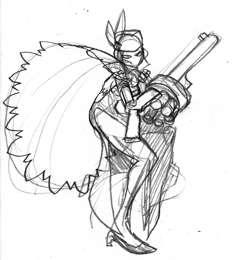
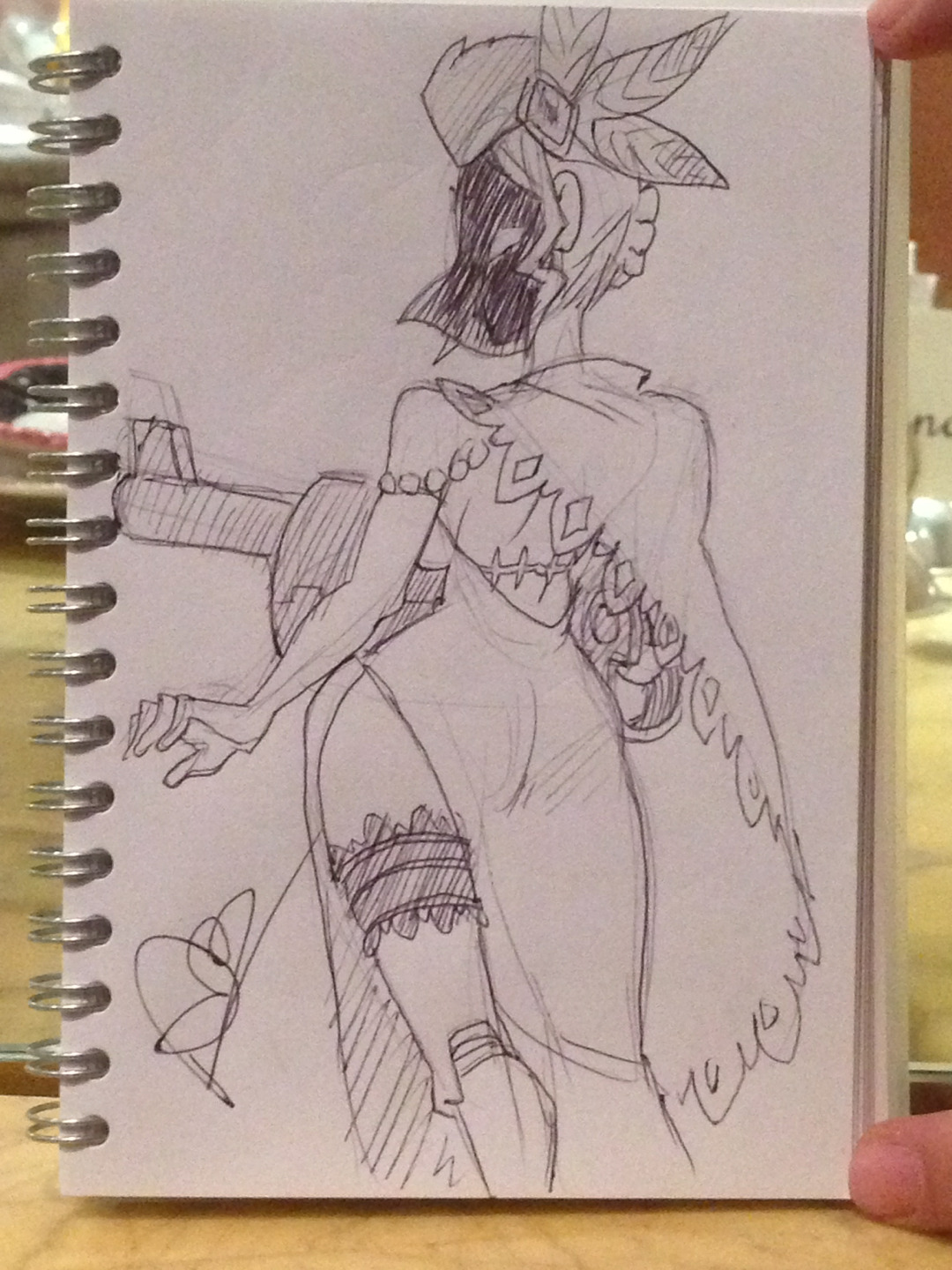
For me, the most important thing to get down right is the idle animation. I already had an idea in my head of what it should look like. I knew I wanted Black Dahlia to have her hand on her hip, possibly playing with her fingers impatiently, moving the bullet that is in the barrel of the gun. Thankfully the image here: http://skullgirls.wikia.com/wiki/Black_Dahlia was a great place to start. I took many progress shots if you would like to see my progress.

I started the process with mouse, but it looked terrible, so I went to buy a Wacom Intuos tablet. If I am not working on it as much as I'd like, I will return it within the first 14 days. Not a huge commitment.

This is only a progress shot. As you can see, I haven't added Dahlia's cape. The dress needs a lot of work. The head needs work. The gun is my biggest challenge currently. Right now I see it looks pretty terrible. My strategy when I start again is to draw lines of perspective to map the gun to. If anyone else has advice on a better way to go about the gun, it is highly appreciated. I am considering saving all dress animation for last.
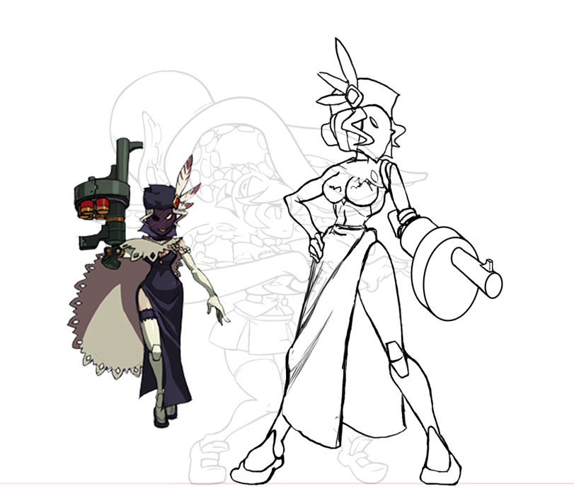
B-Dahlia.jpg


Attached is a height comparison.


Next To-Do:
X Finish Gun 3D Map
X Re-factor First Frame
X Complete First Frame of Idle Animation
 

Attachments

  • Height-Comp.jpg
    Height-Comp.jpg
    361.6 KB · Views: 4,534
Last edited:
mmm~ I agree with this size only for this theme of skullgirls villainous women being tall
 
So is this gonna be a thing now? Where we're desperate enough to animate these characters ourselves? Goodness...

Welp. It looks awesome either way.
 
  • Like
Reactions: Broseidon Rex
So is this gonna be a thing now? Where we're skilled enough to animate these characters ourselves? Awesome

It looks awesome
 
  • Like
Reactions: BeatNinja
Espresso, I wish you good luck on drawing some stuff for Black Dahlia. The drawing looks great so far!
 
Looking good so far~

The only thing I'd point out to be aware of is her head size. All the characters have a very similar skull size, but your Dahlia's head appears decently smaller.

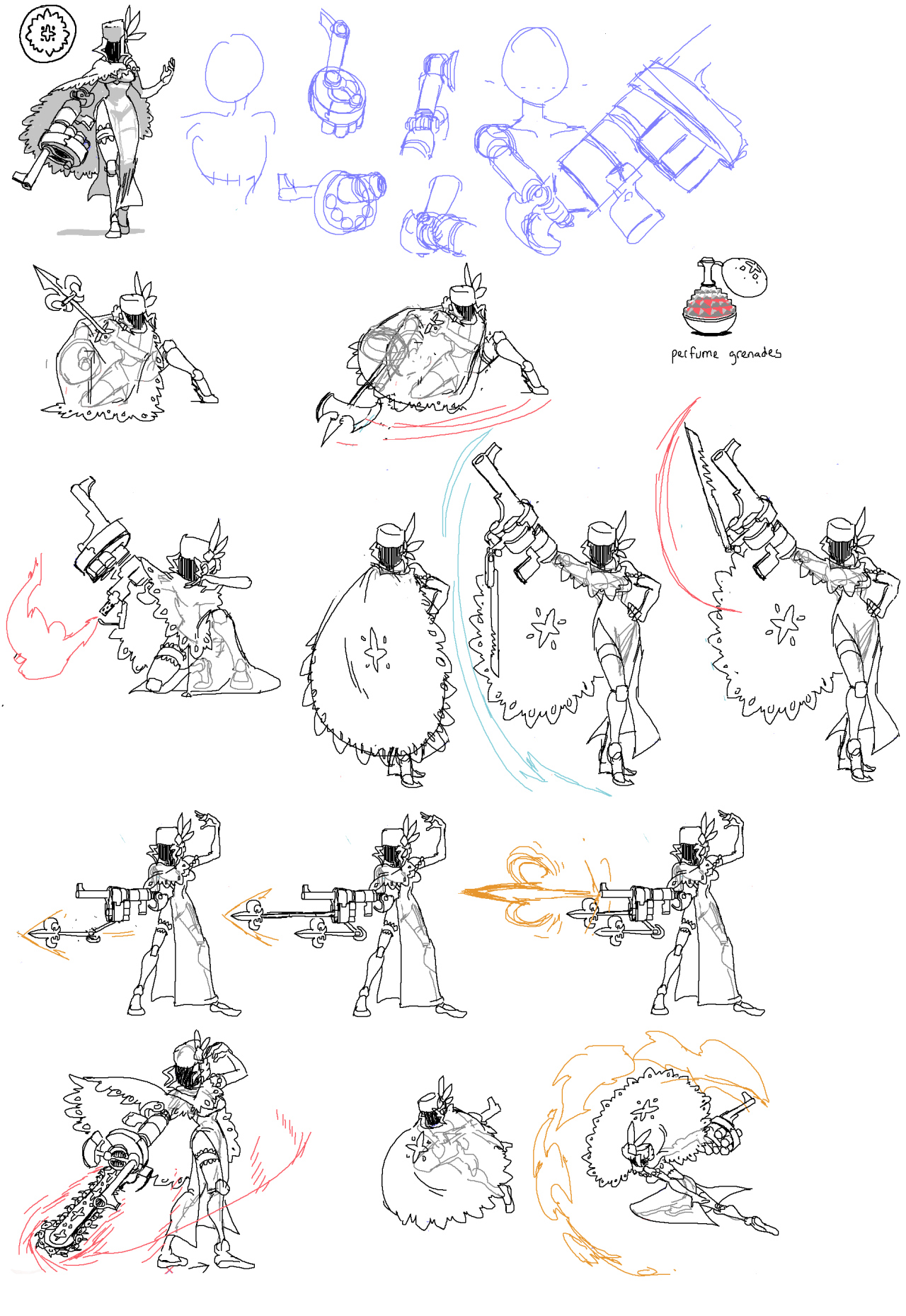
Also, regarding the gun. When Lab Zero do anything with a fixed solid shape (Painwheel's propellor, Big Band's sax, Eliza's staff) they make a 3D model of the object and use that as a reference when they animate. That's what they'd do with her gun arm I'd imagine.

If you can't make a model then I would at least first draw yourself a reference for the gun. Side, front, back, top, bottom views.
 
Last edited:
we have a 3d modeller on skullheart actually if you're looking for someone. you can try asking @Yargin but he uses blender so unless you know how to use it, I'm not sure how useful the model will be. but at the very least you can have it for a reference point. He did one for Andy and it's very handy to have one around
 
I agree with everything Cellsai said, so I won't bother repeating it. My biggest suggestion to you would be to not worry about the details and simply block out the movement of your animation. This means drawing in the lines for the chest, waist, limbs, head, etc. without illustrating in all the small details. The cape could literally just be drawn in as a single curved line, with the extra details of the frills and perforated edges being detailed once the key frames have been blocked in. Developing a 3d model for the gun would also be ideal, as it's a very technically involved part of her design.

I think what you have now is a very good start. I'd say go ahead with your plan and finish the first frame to a point where it contains all of the details, including the cape and gun. This way you have a base to help keep consistency throughout the rest of your frames. But like I said, don't animate all of the frames in this way. Block in your keyframes with only the essential elements, then go back in and clean-up/detail your frames once the motion has been established.

Again, this is looking good. Keep it up!
 
It's looking good but, (and at the risk of sounding like an asshole and conceding I might even be wrong) bearing in mind you are going for a Player 1 side stance, shouldn't the cannon be on the other arm?
Black-Dahlia-Fight-skullgirls-34436617-1280-1858.png

245170_screenshots_2013-08-22_00002-1.jpg

Tumblr_mjxv2ugrzw1s4c693o4_1280.jpg

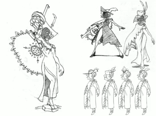
Anyway, to say something that will hopefully ease your cannon woes, Dahlia is described as "keeping her arsenal well hidden" and "cloaking her movement using her doily" so it wouldn't out of place for her to move with that thing as obscured as possible.

Best of luck with this project. Looking forward to see the end result.
 
could just turn her head around for a quick solution
 
It's looking good but, (and at the risk of sounding like an asshole and conceding I might even be wrong) bearing in mind you are going for a Player 1 side stance, shouldn't the cannon be on the other arm?

No, Espresso has it on the correct side. Look more closely at the move concepts. The majority of her moves use her arm cannon in a way that requires her weapon to be on the side facing the opponent. It doesn't matter whether the cannon is on her left or right arm, as long as it's always facing the center of the screen while Dahlia has her chest facing towards the viewer. Yes the concepts show the cannon on her right arm while facing left, but almost all of her attacks are facing left in the concepts. If she were to face the other way and attack to her right, then the cannon would be on her left arm while facing right, just like Espresso illustrated.

Take a look at characters like Squigly and Eliza who have clear asymmetrical qualities . You'll notice that while Squigly's single eye switches sides when she changes from left to right, it's always the eye that's closer to the opponent. Same for Eliza, who's staff is constantly switching from one hand to the other, sometimes mid attack!
 
  • Like
Reactions: Balder
I was just writing the same as Skullmageddon, so to not repeat anything, I'll just add it's the same with Cerebella's diamond tattoo under the right eye and Fortune's scar on the left cheek. For all characters, player 2* is the one who has the left-right placement of characteristic details match official art in story modes and whatnot, interestingly.

*Or to be more precise, the player that's currently on the right side of the screen & facing left.
 
Thanks on the input, everyone! I will sketch out those more detailed pictures of the gun from multiple perspectives, and maybe give Blender a shot if I can figure it out. Maybe I can sketch out these pics and see if anyone is interested in modeling based on my sketches if lucky. The size of Dahlia's skull was/is a glaring issue, and I have slowly made it bigger. With her large hat adding to her hurt box, maybe, and it adding to her size, I am scared of exceeding the height limitation I've set for myself. I have thought of ways to compensate for this in dash/walk/crouch character size. I am thinking too far ahead here though. Thanks for all the advice @Cellsai and @Skullmageddon! @Balder I purposely flipped it because I find it easier drawing characters facing toward the right. It is either me being used to player 1 orientation or more likely, handed-ness. I'm left handed so I subconsciously want to draw the character using their left hand(err..gun-arm) in combat.
 
Last edited:
  • Like
Reactions: Balder
Right-handed artists generally prefer to draw with a person facing the left of the canvas, and vice versa for left-handers. It's easier to draw features away from the hand, as it doesn't obscure it.
 
Hello, Yargin here! As @jam1220 said, I do 3D modeling and I'd be happy to help you out with your 3D model. Just shoot me a message or something.

I'm liking what you got going on here, it looks very nice. Keep up the good work!
 
  • Like
Reactions: southpawper
I purposely flipped it because I find it easier drawing characters facing toward the right. It is either me being used to player 1 orientation or more likely, handed-ness. I'm left handed so I subconsciously want to draw the character using their left hand(err..gun-arm) in combat.
As a fellow leftie, I can certainly relate.
 
The size of Dahlia's skull was/is a glaring issue, and I have slowly made it bigger. With her large hat adding to her hurt box, maybe, and it adding to her size, I am scared of exceeding the height limitation I've set for myself.

There's a couple of things you might want to look at if her height it worrying you.
I did some quick edits to demo it, but this is just my outlook (and I'm in work so I didn't really do a proper job or anything), so don't go changing stuff if you prefer it your way. Some people can take critiques way too much as Gospel sometimes, so feel free to ignore!


Untitled-1.png


Again, this is pretty quick, but on the left is the official image, in the middle is my edited one and the right is your initial picture.

Legs: Dahlia's got pretty dainty feet, so I shrunk em a smidgin'. I also shortened her legs very slightly. She has ginormous legs, but I figured she could lose an inch or two.
Hand: I made her hand a wee bit bigger because it looked a bit on the small size.
Chest: Dahlia has that patented Skullgirls rib cage where the back of the cage barely reaches the bottom of her breasts, and while her midriff is tiny, it's still visible. (My choices with her midriff/hips visibility might just be me misreading how you have the dress folding though. Her chest itself is actually kind of short so that got shrunk vertically a bit too.
Head: All these changes add up and mean her head can be made slightly bigger without making her obtusely tall. (It's kind of hard to tell what's mask and what's skull in your picture so I didn't actually make it much bigger at all) She's definitely supposed to be a tall character though, so it's fine if she does end up pretty tall.
 
  • Like
Reactions: Espresso
There's a couple of things you might want to look at if her height it worrying you.
I did some quick edits to demo it, but this is just my outlook (and I'm in work so I didn't really do a proper job or anything), so don't go changing stuff if you prefer it your way. Some people can take critiques way too much as Gospel sometimes, so feel free to ignore!


View attachment 2684

Again, this is pretty quick, but on the left is the official image, in the middle is my edited one and the right is your initial picture.

Legs: Dahlia's got pretty dainty feet, so I shrunk em a smidgin'. I also shortened her legs very slightly. She has ginormous legs, but I figured she could lose an inch or two.
Hand: I made her hand a wee bit bigger because it looked a bit on the small size.
Chest: Dahlia has that patented Skullgirls rib cage where the back of the cage barely reaches the bottom of her breasts, and while her midriff is tiny, it's still visible. (My choices with her midriff/hips visibility might just be me misreading how you have the dress folding though. Her chest itself is actually kind of short so that got shrunk vertically a bit too.
Head: All these changes add up and mean her head can be made slightly bigger without making her obtusely tall. (It's kind of hard to tell what's mask and what's skull in your picture so I didn't actually make it much bigger at all) She's definitely supposed to be a tall character though, so it's fine if she does end up pretty tall.
Highly appreciated what you did here, and will integrate these revisions when re-factoring. Thank you!
 
Well you have my eyes now almost a little shy to show off my Hollow *edit* frames? in fear of feeling like a follower....In other news whose getting Umbrella up and running?
 
  • Like
Reactions: Espresso
Glad I have another set of eyes! Also have some exciting things happening thanks to the amazingly talented @Yargin!
 
Trying to have daily updates. May in the future keep things things more stretched out (let me know how you'd rather see progress documented).

Updated chest and hand based on @Cellsai 's recommendation. Made legs shorter but kept her foot-size the same. I like the feet size currently, but we will see in the future. The foot-size in comparison to the rest of the cast seem fine in size comparison. Tomorrow overhaul the head and finally get to animating. By the way, @Cellsai you've been such an amazing help. Thank you!

B-Dahlia-Progress.jpg


@Stonechimes Yeah; I really wanted to start this project, but nothing looked good I'd done, so I grabbed one Saturday night and started. Best Buy has a 14 day return policy, so I figure I have 14 days to feel things out and see what I think.
 
Last edited:
Hey isn't the gun supposed to be on the other arm?
Nope. The official designs for all the characters are all drawn as if the character is standing on the Player 2 side of the screen. If this were a real in game sprite it would be flipped when she's facing left, thus giving her the correct side.

eg: Valentine's eyepatch is officially on her right eye. It only appears in game on her right eye when she's on the player 2 side.
 
  • Like
Reactions: Espresso
Went through a lot of head shapes. Still figuring out what I think. Either way WIP of head.
B-Dahlia-New-Head.jpg

Added bonus, sketch without veil + dress.
 

Attachments

  • B-Dahlia-Unmasked.jpg
    B-Dahlia-Unmasked.jpg
    63 KB · Views: 1,694
Last edited:
Went through a lot of head shapes. Still figuring out what I think. Either way WIP of head.
View attachment 2724
Added bonus, sketch without veil + dress.
How sure are you that she has a nose? :P

Every shot of Dahlia takes great care to not show any details of her face, aside from usually only one bright eye and one dark eye, even when shown from the side.
She is very extensively damaged, and the real Dahlia had her face mutilated (though admittedly her nose was not damaged), so there could be a lot more going on on that face than we know.

tumblr_mltlp1BiiP1rhk4y2o1_500.png

Low-res images from the digital art book. Hard to see in this, but the picture on the left has a very distinct white line drawn from her eye, implying there's something else to her face. (Please note a lot of the stuff in this very old art book has been retconned or updated)

Tumblr_mjxv2ugrzw1s4c693o4_1280.jpg


Another oldy (she still has her legs), but take note of the very clearly defined skull shape under the veil. Hmmmmmmmmmmmmmmmm...

Anyway, ignore my meandering thoughts and keep going with the nose if you want - just wanted you to be aware of how carefully no detail of her face is usually shown!

(Also, according to the one shot we see of her ear, Dahlia is an elf, so watch out for that if they appear in your sketches ;D)

Dahlia not human.png
 
Last edited:
I would offer some help but I'm pretty new to all of this animation stuff. I'm pretty decent at drawing I'd say but animating is a whole new beast to me. But if I were able to I'd love to help you make this more than a one man thing. Only if you wanted of course, I understand if you wanna keep it solo.
 
  • Like
Reactions: Espresso
Couple of things to note, Dahlia could have a nose but for art purposes it doesn't show through the mask or seeing as Skulls are a running theme, part of her face could be missing and thus lacks a nose
 
  • Like
Reactions: Espresso
How sure are you that she has a nose? :P

Every shot of Dahlia takes great care to not show any details of her face, aside from usually only one bright eye and one dark eye, even when shown from the side.
She is very extensively damaged, and the real Dahlia had her face mutilated (though admittedly her nose was not damaged), so there could be a lot more going on on that face than we know.

tumblr_mltlp1BiiP1rhk4y2o1_500.png

Low-res images from the digital art book. Hard to see in this, but the picture on the left has a very distinct white line drawn from her eye, implying there's something else to her face. (Please note a lot of the stuff in this very old art book has been retconned or updated)

Tumblr_mjxv2ugrzw1s4c693o4_1280.jpg


Another oldy (she still has her legs), but take note of the very clearly defined skull shape under the veil. Hmmmmmmmmmmmmmmmm...

Anyway, ignore my meandering thoughts and keep going with the nose if you want - just wanted you to be aware of how carefully no detail of her face is usually shown!

(Also, according to the one shot we see of her ear, Dahlia is an elf, so watch out for that if they appear in your sketches ;D)

View attachment 2726
Very useful, thank you! I will redo the head tonight!
 
How sure are you that she has a nose? :P
Worth what it's worth, it kinda looks like she has a very prominent "crone nose" in this illustration. But then again, she doesn't have the elf ears, so...
tumblr_mh6eprAgSX1rip8ybo1_1280.jpg
 
@Cellsai one issue I've had is that most of the concept art for Dahlia seems to have her skull relatively smaller compared to the other characters. Maybe not filia but she has Samson. One way of comparing is to move the skull over the chest of the char. I feel dahlia may have more human sized skull. I can be absolutely wrong; I feel the shape I have now is definitely too defined and too long. I must make a conclusion. @Mysterygamer3k maybe you can assist with the head if you'd like to give it a shot? I like the position I am attempting to go for where Dahlia has a high-nosed, condescending view of her opponent.
 
I believe the fact her skull seems smaller is more due to her face always being under a veil, casting it more as a silhouette rather than her actual face which means there's going to be shifting in it to an extent. Another thing I noticed is that after double checking her proportions based on her concept artwork and images she seems to hover around 6 and a half heads tall approximately. you could probably play with that slightly but keeping it close to that is about what you want I think. As for how that stacks up to humans, well I'm sure you know in art 8 heads tall is the picturesque and "ideal" human figure height and something closer to reality is around 7 and a half heads tall. She's still one of the tallest of the cast by far, right up there with Eliza but she's still underneath the realm of what I would typically call normal or realistic proportions, at least for a full grown adult.

As for helping with the head, I could give it a shot and see what I can do with it, sure. I'll also try re-drawing the pose you have made and that I also like, in 6 and a half heads tall proportion and see if that fixes some of the issues some people have seemingly had with the length of her legs etc. etc.
 
It's a bit rough but I adjusted her face to something I thought looked simple enough to suggest the face underneath the veil but to keep it all in shadow as seems to be the theme with her design. You could add or subtract the devious smile from her face anytime you wanted to honestly so I just left it out for the time being though I did play around with having it there, just to see how it would look. I also tweaked the overall size of her head in relation to her body to make her proportions a little more correct, in relation to most all of her conceptual designs.

Dahlia_face.png
 
Also, I apologize if I'm being overly critical here. I mean, you haven't even finished the first frame and I've done massive commentaries on everything!
 
Also, I apologize if I'm being overly critical here. I mean, you haven't even finished the first frame and I've done massive commentaries on everything!

To be honest I would love to do a turn-around for Dahlia since that will no doubt be very essential. Though I think Espresso would probably like to take it at a more deliberate pace.