• As part of the relaunch of Skullheart, ALL previous threads have been archived. You can find them at the bottom of the forum in the Archives (2021) section. The archives are locked, so please use the new forum sections to create new discussion threads.

Black Dahlia Animation Journey

Okay, I took to heart @Cellsai and @Mysterygamer3k 's suggestions. You are both completely right about the nose, and I went way of the track with that. Thanks for bringing me back in! I liked your suggestions @Mysterygamer3k and I decided to redo the head completely based on your art and the other suggestions. I didn't put a ton of detail in it tonight, because I was mainly focused on a Black Dahlia animation.
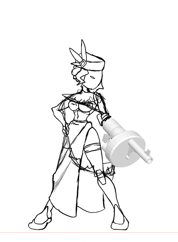
Latest-Dahlia.jpg


You might notice a new amazing 3D arm-gun! Thanks to the incredibly talented and prompt @Yargin for creating it and making quick updates. This picture doesn't give it justice so here are some more detailed pictures:
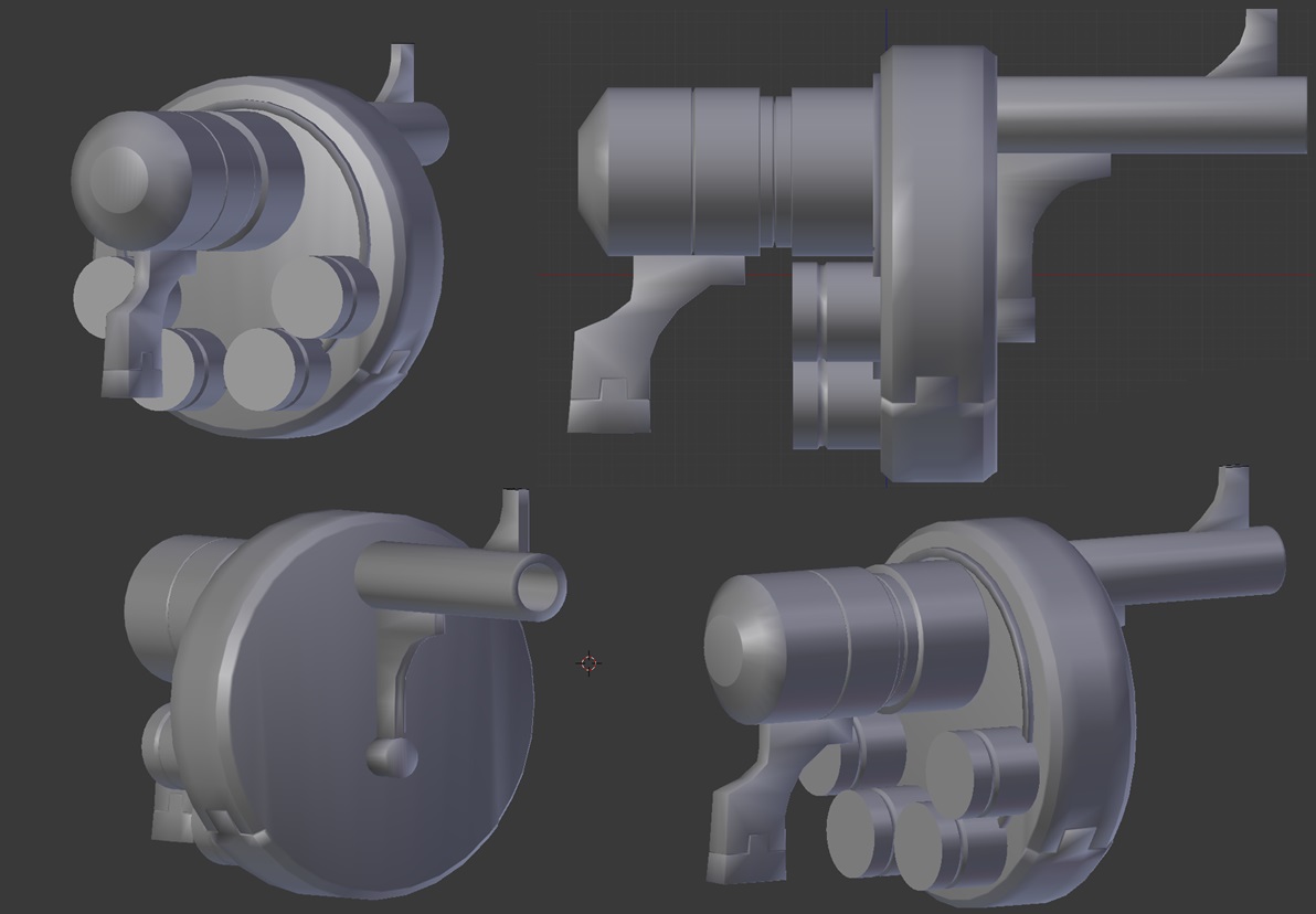
3D Gun by Yargin.jpg


Thanks everyone for all the suggestions. I am trying to get a little done every night.


To be honest I would love to do a turn-around for Dahlia since that will no doubt be very essential. Though I think Espresso would probably like to take it at a more deliberate pace.
What do you mean? A turn-around animation, or a start over?
 
Okay, I took to heart @Cellsai and @Mysterygamer3k 's suggestions. You are both completely right about the nose, and I went way of the track with that. Thanks for bringing me back in! I liked your suggestions @Mysterygamer3k and I decided to redo the head completely based on your art and the other suggestions. I didn't put a ton of detail in it tonight, because I was mainly focused on a Black Dahlia animation.
View attachment 2742

You might notice a new amazing 3D arm-gun! Thanks to the incredibly talented and prompt @Yargin for creating it and making quick updates. This picture doesn't give it justice so here are some more detailed pictures:
View attachment 2743

Thanks everyone for all the suggestions. I am trying to get a little done every night.


What do you mean? A turn-around animation, or a start over?

A turn around typically refers to a reference sheet of a character at scale with the figure in question being turned around to give a viewpoint default from multiple angles, usually from straight ahead, a profile or side-view, 3/4 front and/or back, and from behind the character. It's just something that helps animators have a point of reference for key positions the characters can be standing in and angles they could be viewed from.

It's not all-encompassing and is not really a catch all since some poses are going to require key positions that are drawn completely from scratch or nearly from scratch. But it helps with a lot of the standing poses and for things like walking which requires a profile perspective on the character usually.

As an example, this would be a very basic turn-around reference for a female character.

http://fc05.deviantart.net/fs71/f/2...rnaround_study_by_xandria_tchebbi-d5qjdi5.jpg
 
  • Like
Reactions: Espresso
A turn around typically refers to a reference sheet of a character at scale with the figure in question being turned around to give a viewpoint default from multiple angles, usually from straight ahead, a profile or side-view, 3/4 front and/or back, and from behind the character. It's just something that helps animators have a point of reference for key positions the characters can be standing in and angles they could be viewed from.

It's not all-encompassing and is not really a catch all since some poses are going to require key positions that are drawn completely from scratch or nearly from scratch. But it helps with a lot of the standing poses and for things like walking which requires a profile perspective on the character usually.

As an example, this would be an example of a simple turn-around reference for a female character.

http://fc05.deviantart.net/fs71/f/2...rnaround_study_by_xandria_tchebbi-d5qjdi5.jpg
If you did this. You'd be a God.
 
If you did this. You'd be a God.

Thing of it is I'm not sure how much detail to exactly go into for it, obviously I would include things such as her hat, veil, heels, and dress. However, I'm not sure if including her gun or her draped uhm, sash/cape thing? Not sure what exactly to call it as I'm not privy to the actual name of that article of clothing, if there is one. But yeah I think leaving that out would be necessary as well as simply cutting away the gun from her arm.

Also what program are you using for the Gun model? That would be amazing to have for drawing her when animating later on, if I ever reach that point myself. X3
No pressure! I imagine making a psd with those things as layers might be nice. @Yargin made the gun model I believe with Blender. I just brought it in to Photoshop. I set the scene to 'flat', which takes away how smooth the model actually is, but I can see the lines easier.
 
No pressure! I imagine making a psd with those things as layers might be nice. @Yargin made the gun model I believe with Blender. I just brought it in to Photoshop. I set the scene to 'flat', which takes away how smooth the model actually is, but I can see the lines easier.

That's pretty sweet that you got that model to work with. :D As for making a turn around in Photoshop I pretty much work exclusively with Photoshop so that would be the format it is anyway heh. I'll try to work on that when I can and see what I can come up with for it though.
 
I'm baffled where all the skill comes from in this community. It's nuts.
 
  • Like
Reactions: Espresso
Alright, it's nowhere near fully complete but anyone could technically use this to make their own. I kept it with scale to the last rendition of Dahlia I drew, kept it at the same resolution on the same level plane and added guides for the level of all the essential proportional markers. If you want specifics like arm lengths etc. etc. you'd have to do it separately.

Here's the roughs for Dahlia's turn-around sheet so far. Very rough though, keep that in mind.

Dahlia_turn-around_roughs.png


For comparison to my last, here is the image I did for Dahlia's face showing that the scale is the same for both.

Dahlia_face.png
 
  • Like
Reactions: Espresso
I'll see if I can find the sketches I did for the picture in my avatar, because IIRC I made quite a few notes about some of the smaller details.
 
  • Like
Reactions: Espresso
Really my biggest issue thus far is just keeping her ankles and feet at a consistent design as it's really sort of messy and un-clear in all the concept artwork and sketches that Alex made, I'm sure he had a solid design for her feet and ankles in his mind but I can't see into Alex Ahad's mind to find out and even if I could I likely wouldn't want to, I'd probably come out twisted like a Chaos soldier from Warhammer 40k tossed into the warp.
 
  • Like
Reactions: Espresso
To keep with my routine of daily updates, here is an animation I am working on (early draft), enjoy:
S-MK-WIP.gif
 
Last edited:
Hmm, the head seems static and seems to slow.
Otherwise the movement seems really appropriate.

Well that is a rough draft to be fair, he's probably just keeping the head static until he works out the rest of the animation roughs. Don't forget that in-betweens for animations need to be done after timing on the attacks is figured out Espresso, so taking it beyond the primary key poses in the action isn't all that necessary. If Lab Zero would ever put it into the game, it'd have to be the roughs first. I mean, obviously it'll need to have more details from her actual clothes on the model in the animation but otherwise it looks good to me so far. :D

Edit: upon closer inspection, her torso, chest, and shoulders are not moving much at all either, they feel too stiff in those animations, perhaps try to loosen them up as from what I can tell her torso, at least from the middle up, meaning her breasts, shoulders etc, are still fleshy bits and would move and respond to motion as such.
 
  • Like
Reactions: Espresso
Well that is a rough draft to be fair, he's probably just keeping the head static until he works out the rest of the animation roughs. Don't forget that in-betweens for animations need to be done after timing on the attacks is figured out Espresso, so taking it beyond the primary key poses in the action isn't all that necessary. If Lab Zero would ever put it into the game, it'd have to be the roughs first. I mean, obviously it'll need to have more details from her actual clothes on the model in the animation but otherwise it looks good to me so far. :D

Edit: upon closer inspection, her torso, chest, and shoulders are not moving much at all either, they feel too stiff in those animations, perhaps try to loosen them up as from what I can tell her torso, at least from the middle up, meaning her breasts, shoulders etc, are still fleshy bits and would move and respond to motion as such.
Thank you! Yeah it's still an early draft, so I am just trying to get the proportions/skeleton right at first. Then I will move on to the other bits slowly. I'm glad you like it!
 
Thank you! Yeah it's still an early draft, so I am just trying to get the proportions/skeleton right at first. Then I will move on to the other bits slowly. I'm glad you like it!

Oh no problem! I'm excited to see it really starting off for real like this, it's quite fun to see it happening. Although I was going to ask is all you're working off of for her move set right now the conceptual artwork? If so you might want to set aside a little time to try designing some other ideas for attacks since the vast majority of her normals are missing from the conceptual artwork.
 
Oh no problem! I'm excited to see it really starting off for real like this, it's quite fun to see it happening. Although I was going to ask is all you're working off of for her move set right now the conceptual artwork? If so you might want to set aside a little time to try designing some other ideas for attacks since the vast majority of her normals are missing from the conceptual artwork.
Yeah, I agree. Plus I still have to make all her parts complete like the artwork you created. I'll try holding off (I might do them anyway because this is mainly for fun)! I based this attack off of her Wiki:
Don’t let the giant gun distract you when the blade hidden in her knee cap is tearing at your liver!
and the visual has been stuck in my head >.<
 
Last edited:
Yeah, I agree. Plus I still have to make all her parts complete like the artwork you created. I'll try holding off! I based this attack off of her Wiki: and the visual has been stuck in my head >.<

Oh no problems at all, I think it looks great and works perfectly fine for an attack. It looks like it could be something like a medium kick chain to me, which I'm fairly sure is what you were going for.
 
I'm baffled where all the skill comes from in this community. It's nuts.
It's how they make up for being bad at the game.
 
I may not be home tonight so I tried to get some work done today to stick with my daily routine. I updated the animation a bit:
S-MK-WIP-2.gif
 
  • Like
Reactions: SmashBlade
oh wait I just realized why I found this familiar it's like the Parasoul kick but instead of another kick it's knife
tumblr_mmg195nKsP1snd101o3_1280.gif
 
I'm baffled where all the skill comes from in this community. It's nuts.
You'd be surprised how this game has brought out the talent of people and us together. To put it simply we have people brought in by the fighting engine and the other half brought in by the art the combination truly reflects how Mike and Alex came together to make Skullgirls. One day I will learn to animate so that I can surprise people with Hallow animations. And @Skullmageddon I keep saying it but I will finish that Annie shading soon
 
I suggest her defeat be her veil comes off and she hysterically covers her face
I love this idea, and will mark it down. Thank you!
 
Wait! Wait! WAIT!

Stop everything!!!!
.
.
.


Parasoul has a booty jiggle!?!?!?

dat-ass-meme-generator-dat-ass-401d6d.jpg
 
  • Like
Reactions: ruins72
So I started the turn around today. Something about the sideview bothers me a lot, maybe the legs aren't straight enough? The arm on the front-view is just a quick trace over of the pic from the DLC picture. The heels on the side view I got the idea from this amazing fan-art:
http://matsuatype55.tumblr.com/post/85475423908/drew-black-dahlia-skullgirls

I saw this after making the front-view but will update. Do you think the heels are too high? Dahlia is an assassin and I might make them a little shorter.

Will add all the details next and redo any frames I've done to have the new heels.

Thank you!

Turn-Around.jpg
 
  • Like
Reactions: Mysterygamer3k
So I started the turn around today. Something about the sideview bothers me a lot, maybe the legs aren't straight enough? The arm on the front-view is just a quick trace over of the pic from the DLC picture. The heels on the side view I got the idea from this amazing fan-art:
http://matsuatype55.tumblr.com/post/85475423908/drew-black-dahlia-skullgirls

I saw this after making the front-view but will update. Do you think the heels are too high? Dahlia is an assassin and I might make them a little shorter.

Will add all the details next and redo any frames I've done to have the new heels.

Thank you!


I think the shoes and the way her feet look seems good, as for how high the heel should be exactly I'm not sure they should be quite as high as they are embellished in the fan art and yes I used the DLC artwork for the front view but I mainly did that as it was a perfectly fine and acceptable look at her from the front. I saw no reason to not use what reference I could to help make the turn-around a little more easily seeing as there's so little to work with in the way of official artwork.

As for the work on the turn around so far, it looks pretty good so far from what I can tell, her hips look a little odd from the front perspective though, I'm thinking it's because of the way her legs join is not sloped enough and looks more like bubbles, maybe slightly lower her crotch and make the lines where her legs meets her hip a little more smooth and sloped/subtle. Other than that I have no other major criticism for it. ^^
 
Lotsa stuff off in side view.
Eyes could be moved forward, also should be a bit narrower from that angle.
Balance is off, she's going to fall forward if she keeps standing like that.
From the chest to the waist she caves in, but if she's standing erect as her back indicates, bottom of the rib cage would be jutting out. Focus on drawing the rib cage first, breasts tacked on last. They're also a bit big here :P
Speaking of breasts, they aren't attached to the neck. Define the clavicle and upper rib cage. It's also helpful to keep in mind that realistically, breasts never "start" above the arm pits, but skullgirls can certainly take its artistic liberties.
As Mysterygamer just said, the crotch is a bit high in front view. And usually the hips are at their widest in line with the crotch, though I'm not sure how they look on black dahlia, and again skullgirls can take its artistic liberties.

So uh, that's a lot of criticism. Not trying to sound complainy, just trying to help you improve!

edit: so many typos
 
Last edited:
  • Like
Reactions: Espresso
Lotsa stuff off in in side view.
Eyes could be moved forward, also should be a bit narrower from that angle.
Balance is off, she's going to fall forward if she keeps standing like that.
From the chest to the waist she caves in, but if she's standing erect as her back indicates, bottom of the rib cage would be the jutting out. Focus on drawing the rib cage first, breasts tacked on last. They're also a bit big here :P
Speaking of breasts, they aren't attached to the neck. Define the clavicle and upper rib cage. It's also helpful to keep in mind that realistically, breasts never "start" above the arm pits, but skullgirls can certainly take its artistic liberties.
As Mysterygamer just said, the crotch is a bit high in front view. And usually the hips are at their widest in line with the crotch, though I'm not sure how they look on black dahlia, and again skullgirls can take its artistic liberties.

So uh, that's a lot of criticism. Not trying to sound complainy, just trying to help you improve!
Thanks, much needed! I was just going to take a step away from the side view cuz I felt I flubbed it. I thank you highly!
 
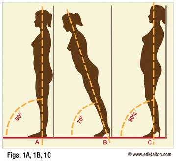
And today Cellsai teaches us that wearing heels makes your tummy bigger. No, seriously. Look at that picture again.
 
And today Cellsai teaches us that wearing heels makes your tummy bigger. No, seriously. Look at that picture again.
Yup. Because standing in heels it forces you to curve your spine, thus forcing out your stomach area while pulling back your shoulders. ;P
 
  • Like
Reactions: Espresso
Holy crap that's how heels work? So the thing I heard about heels making a girl's booty look bigger is true?
Or at the very least they look more perky.
 
Holy crap that's how heels work? So the thing I heard about heels making a girl's booty look bigger is true?
Or at the very least they look more perky.
Not to get off topic but yes if girls want to make their butt look big or draw attention to their chest they arch their back which ironically is how Alex has all his more mature characters do tis his drawing style

Edi: it doesn't have to be heels it could be converses or socks just like if a girl wants to look more slim or her butt bigger she'll wear black clothing and black yoga pants respectively or Red on the features she wants to draw attention to is all an illusion but it's how you sell it, don't ask how I know I mainly draw women so Ive done studies plus mainly women have been a big influence on me and my drawing.

P.s mods sorry if i took it off topic and @Espresso
 
Last edited:
Yeah, I like posting that animation because it's so ridiculous. Such attention to detail.

Yeah, right? And it gives such an impact and weight to the move too. Splendid work! I'm serious.
 
  • Like
Reactions: Espresso