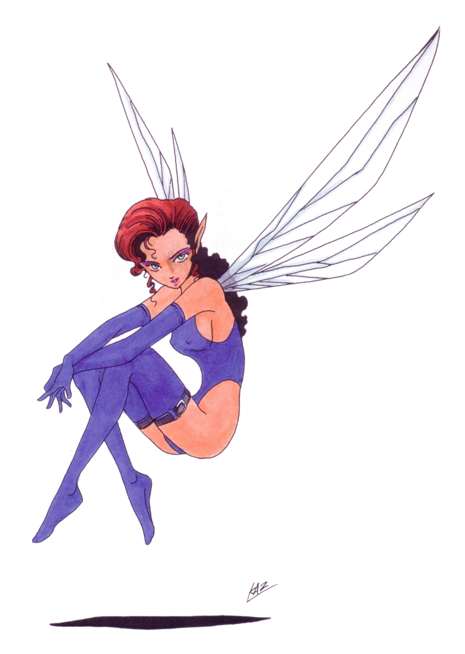
SanoBaron
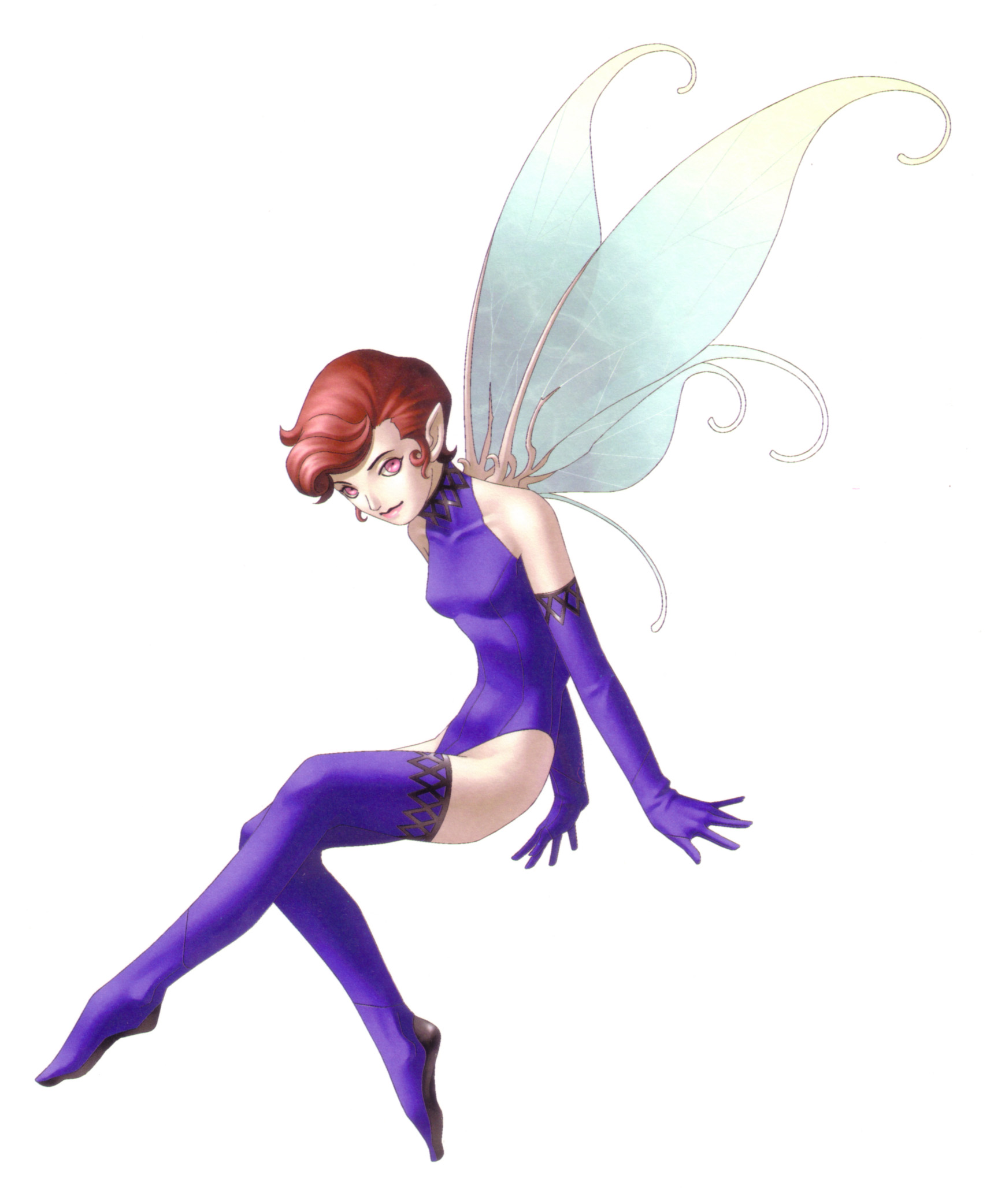
Delicious chewable Hubba-Bella
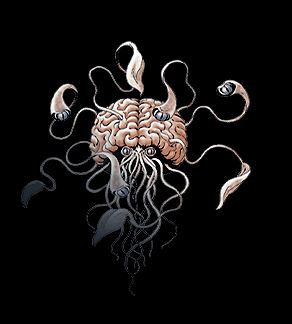
this kinda design is a regular thing of Amemiya. And that's just one of the two examples I could find for Amemiya's designs in SMT4. I personally love it. Its so disjointed and uneven and that works for me.

this kinda design is a regular thing of Amemiya. And that's just one of the two examples I could find for Amemiya's designs in SMT4. I personally love it. Its so disjointed and uneven and that works for me.
I love bayonetta.. no wonder Anne clicked with me instantly... confirmed Jeanne's decedent lol

It's most likely demons, which has been mentioned already. These are probably demons again, like from 1 and 2As I'm reading some translations for the weekly Famitsu, I realize that I don't think anyone has mentioned this part of the trailer yet:
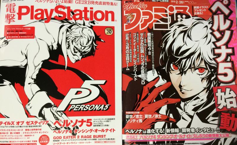
So uh, we fighting Personas now? (Edit for better screen grab)
From Gematsu "Katsura Hashino is choosing to remain quiet about why Personas are appearing as actual enemies and where the protagonist has his fights. There are reasons behind those details, though."
Yeah, past Persona games used the (then) designs for demons found in the SMT mainline series (pre-nocturne) for their enemies.

demon/persona designer on p3, 4 and 5.
As far as Kaneko's designs I think the "sweet spot" for me was SMT II and Persona's 1/2.
Looking at the designs Kaneko created for the MC of SMT II it tells a lot about how he envisioned the setting alongside the character's design.
Aleph is initially living in the slums of a post apocolyptic world where people like him fight for the right to move into the higher class city called Center. His equipment looks appropriate for this type of background, it looks worn but functional and he's got a very serious look on his face.
Contrast this with his later reinterpretation of Aleph.
This new aleph doesn't really look like a warrior from a post apocolyptic work what with how form fitting and stylized his clothing are. The redesign suffers from a lot of minor gripes I have with Kaneko's later designs for humans. Like DukeMagus pointed out his later designs have this porcelain skin to them and in addition to that the eyes are vacant and overall the face looks pretty lifeless. This worked well in Digital Devil Saga and for the Mannequins in Nocturne but not so much for other games.
those games aren't on his list of involvements on both his wikipedia and his SMT wikia page.
well, some of them are iconic.
Kaneko only designed the demons in Devil Survivor, not the characters. I'll admit I'm not that bothered by the boobs in DS, though, from what I've seen it's only the two females that are in the beginning of each game.Kaneko's designs are iconic, I agree. They could show a little more differences. I feel his work on the Persona character designs are some of his best, since they still all contrast while keeping his style, unlike the works on the darker SMT games, where they all have that porcelain skin with the same face looks.
That being said, I find the Devil Survivo character designs distasteful, due to not only how anime-ish they are, but also with just the design on the chaactes. A lot, most, of the femals have gravity-defying melons, some larger than they should be for high schoolers, and some of the personalities ae annoying when tied with their appearances. It's more of a preference, but I prefer those down-to earth appearances for the humans that you get in other series in th SMT series.
I heard they had the Etrian guys do some of the art for Q, or at least the bosses. was Saejima behind Zen and Rei? also, I like Zen's spiked collar and try hard cape. it's so edge that it becomes funny to me. Rei I felt fit in perfectly.I guess, some of the designs in general of DS are otherwise bland for me.
Soejima's artwork is great, I'm not saying anything against that. I know Kaneko didn't do DS, but I don't like the art style of DS. I like Kaneko's works on the P3 and P4 cast in the artwork for those games, some of his more vaied work yet it still fits to his style, and it's some impessive stuff. Soejima also does it great. The worst art style, honestly, for the SMT series, has been Q's style. It's simple but almost too much so. It might be because Zen and Rey contrast design-wise from everyone else so heavily it's ridiculous. The two don't fit in character-wise, too one-note, and art styl wise either too overdesigned in an anime-ish way that contrasts with th more anime style using fairly realistic appeareances.
But think about the math involved in supporting them in the first placeThat being said, I find the Devil Survivo character designs distasteful, due to not only how anime-ish they are, but also with just the design on the chaactes. A lot, most, of the femals have gravity-defying melons, some larger than they should be for high schoolers, and some of the personalities ae annoying when tied with their appearances. It's more of a preference, but I prefer those down-to earth appearances for the humans that you get in other series in th SMT series.
