• As part of the relaunch of Skullheart, ALL previous threads have been archived. You can find them at the bottom of the forum in the Archives (2021) section. The archives are locked, so please use the new forum sections to create new discussion threads.

Beast's Fury Kickstarter is Live!

Status
Not open for further replies.
I only tried it once, and I remember it being less playable than Beasts Fury currently is :x

(I'm with everyone else shitting on this game, but I don't think that argument is sound)

It depends on what build you're talking about. I wouldn't even entertain the 2004-2005 builds as being a part of Skullgirls; entirely different programmer and game designer, entirely different game. They were horrible, but the people who made those horrible prototypes aren't even working on Skullgirls anymore.

The correct comparison would be comparing the 2010 prototype builds that Mike created to the final game... and those builds were infinitely more functional than Beasts Fury currently is. IPS had already been implemented at that point so at the very least, there were no infinites. :p

But from what i remember this version is a demo presentation build for the dev right?
At the end of the day this is just something that needs to be good enough for a publisher to be like "This looks cool and interresting. we'll fund your game." It's basicly the same thing that MikeZ presented back in the day with Autumn Games. Then again now is a really tough time in the genres market space to be going about finding someone that wants to put money towards it. Especially if it's a rather new developer.
Does it have anything catchy going for it that might get a publishers attention though?
At the end of the day this isn't even something that should be taken seriously, it's fluff for marketing purposes to get themselves a ride on the back of a publisher. Atleast thats what i read out of it from the kickstarter thing.

No publisher in their right mind is going to back a project that needed two Kickstarters to reach a half-finished state.
 
It depends on what build you're talking about. I wouldn't even entertain the 2004-2005 builds as being a part of Skullgirls; entirely different programmer and game designer, entirely different game. They were horrible, but the people who made those horrible prototypes aren't even working on Skullgirls anymore.

The correct comparison would be comparing the 2010 prototype builds that Mike created to the final game... and those builds were infinitely more functional than Beasts Fury currently is. IPS had already been implemented at that point so at the very least, there were no infinites. :p
Yeah, I was talking about the 2004-2005 builds. I figured if we were talking about the first playable Beasts Fury demo then it'd make sense to compare it to the first playable Skullgirls demo.
 
Ironically, this video came out just yesterday, and it was so painfully needed for the crew of Beast's Fury.

 
  • Like
Reactions: HeadcrabNinja
this is just something that needs to be good enough for a publisher to be like "This looks cool and interresting. we'll fund your game."
But didn't random people already fund this game?
Twice?
 
  • Like
Reactions: HeadcrabNinja
I didn't know they were backed before the last kickstarter. News to me. I guess this tells a story then.
 
Last edited:
The "Street Fighter" styled combo system wasn't even remotely close (the timing was pretty erratic)
There's a function you need to use when scripting timings in Unity, that makes the process frame rate independent. My guess is they didn't even do enough research to figure this out.
 
Honestly, I don't care about the game, but would that have changed anyone's perspective? Even a little? Wasn't most of the underlying disdain from horrible money management coupled with unprofessional PR?
 
This game is getting BETTER by the day. Jesus what a train wreck.

That settles it. I'm going to get an updated version of the demo and I'm going to make a video about this shit.
 
Last edited:
  • Like
Reactions: dead
OH AND DON'T FORGET THE FUCKING PATREON FOR BEASTS FURY. https://www.patreon.com/Beastsfury

thanks Zid, these links are so helpful for me tearing up these guys arses. kisses.
Did not know about that one (looks like there's only one Patreon so far though). Their indiegogo was flexible funding, so I can only assume the other two Indiegogo's were flexible funding too. Can't know how much additional money they got there (though it probably wasn't TOO much). And then of course people have at least at one point been donating directly into their Paypal, which is visible on the first IGG link I posted.
 
additional news folks. Beasts Fury's website is taken down. Stated that the Domain is Suspended. take a look for yourself.
 
  • Like
Reactions: Icky
Good thing SG didn't turn out like this.
I can only imagine that in an alternate universe, Beasts Fury is the one that got super famous and Skullgirls is the one that this happened to
Imagine it
Beastheart instead of Skullheart.
Actually no let's not that's horrifying
 
Thank You so much for introducing JonLajoie to me.
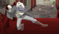
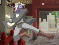
As for Beast's Fury, I know most actually like the animation, but it's actually lacking a lot to me. For example, they can't seem to put patterns onto certain clothes, such as pinstripes onto Don's pants, although it's not on his VS Art either, which I guess both lacks depth. Plus, I actually don't like the frames to which they animate with because I look at it and think to myself, "That animation doesn't have much meat to it, no sense of impact when Don is hit most times, no good sounds that let you know you made a hard impact." Even the Vanilla release of Skullgirls had less GB than Beast's Fury, so they need to work on their programming skills and compressing as much as they can. The voice acting is pretty awful too, especially that epic defeat scream from Don, but they may get better with time. I think they should have mirror characters wearing two different color schemes, like Skullgirls, so players don't get confused as to who's who. This game can be the best it can be if they really try.
Also this guy is great at giving technical criticism.
 
Last edited:
I have to agree that the animation is not the best. LordDirk is doing his best I think, but he's the only decent one in the team. The rest is average deviantart material. Kind of weak. I hate the shoes most of all
 
upload_2015-1-25_10-41-15.png

I'm stressed.
 
yeah. Like see here. This Vinc's j.mk: jmk.png

and this is his j.hk:jhk.png

do you guys see a problem? It's the leg position they are in same area/ same position, this makes the two moves very hard to differentiate, especially in a quote on quote "Fast Paced" fighting game.

moves lack the Stretch or Squash needed to make a move look good or believable. Vinc's st.mp doesn't have this when it really should because without a stretch or squash at where his hand is coming it adds way too much weight to the move, making it look heavy and sluggish when it really should be.
 
Last edited:
yeah. Like see here. This Vinc's j.mk: View attachment 7853

and this is his j.hk:View attachment 7854

do you guys see a problem? It's the leg position they are in same area/ same position, this makes the two moves very hard to differentiate, especially in a quote on quote "Fast Paced" fighting game.

moves lack the Stretch or Squash needed to make a move look good or believable. Vinc's st.mp doesn't have this when it really should because without a stretch or squash at where his hand is coming it adds way too much weight to the move, making it look heavy and sluggish when it really should be.
You watch my video? ONe of the moves that sticks out that is like "Where was the animation?" was j.LP. Vincent throws an Elbow, but it's hardly noticeable.
 
i know, i know kitty. it's just. the kicks just annoy me cause they look the same. Like no fighting game character has similar looking normal moves. oh and cr.lk and cr.mk look the same too. fuck me.

The animation of a fighting game shouldn't be realistic it should be exaggerated, powerful, and slightly cartoonish.
 
  • Like
Reactions: CountofBleck
i know, i know kitty. it's just. the kicks just annoy me cause they look the same. Like no fighting game character has similar looking normal moves. oh and cr.lk and cr.mk look the same too. fuck me.

The animation of a fighting game shouldn't be realistic it should be exaggerated, powerful, and slightly cartoonish.
Agreed, my first thought when I saw gameplay was "it's too realistically animated" (In terms of movement and proportion) so not only do the moves not look cool, but they aren't distinct.
I mean all the big fighting games do that, especially the 2D ones with 2D graphics (they aren't limited to character models, a punch or a kick can involve a prop or even stretch across the screen)
 
well these guys said that they were inspired by the animation of Street Fighter 3, and yet these animations take zero notes from the animation of the game. like... the only move that uses proper blur, stretch, and squashing is Vinc's s.hp. but other moves that should have these effects don't. like Vinc's standing round house. like what the hell?
 
Maybe they meant "oh this move is pretty let's try and make a cheap imitation of it without studying the animation process"
 
It's too bad that we didn't get the Egoraptor raptor in this game..........
 
Status
Not open for further replies.