Bucky Barkley
Well-Known Member
- Joined
- Sep 3, 2013
- Messages
- 343
- Reaction score
- 409
- Points
- 63
- Age
- 35
- Steam
- Bucky Barkley
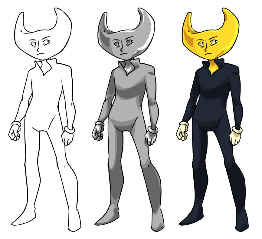
*ANGRY HYPERVENTILATION*
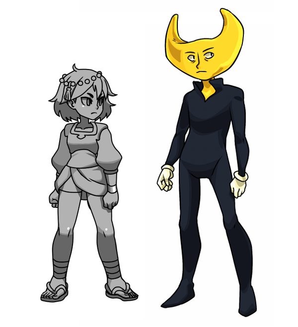
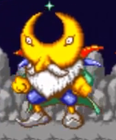
He looks like the Moon King or whatever that was, from Whirlo.
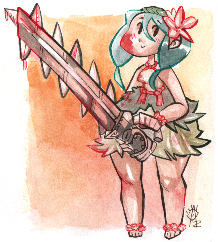
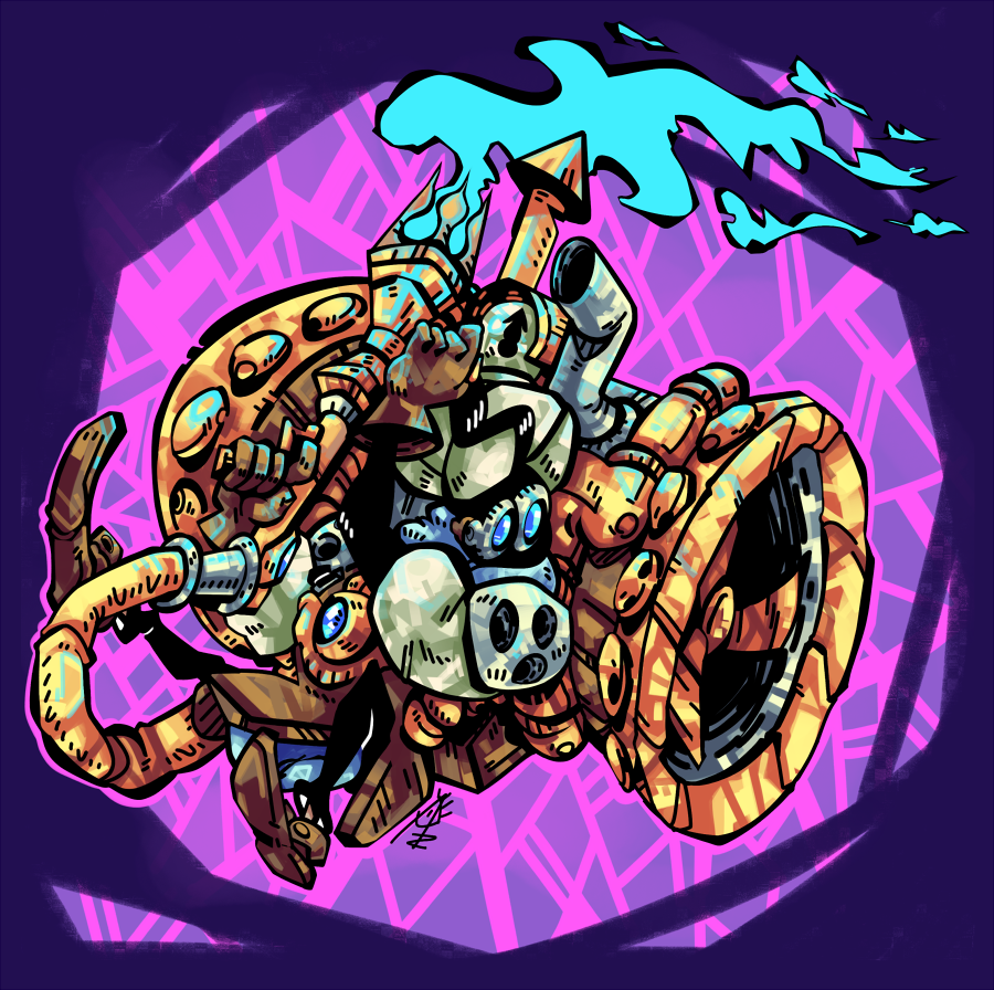
Wow you're always on the case :'D I see your point, can't fix much about it but will in future pictures! Does changing the background tone help a bit?
I'm not a fan if that game's visuals... I don't like blubbly nes games in general
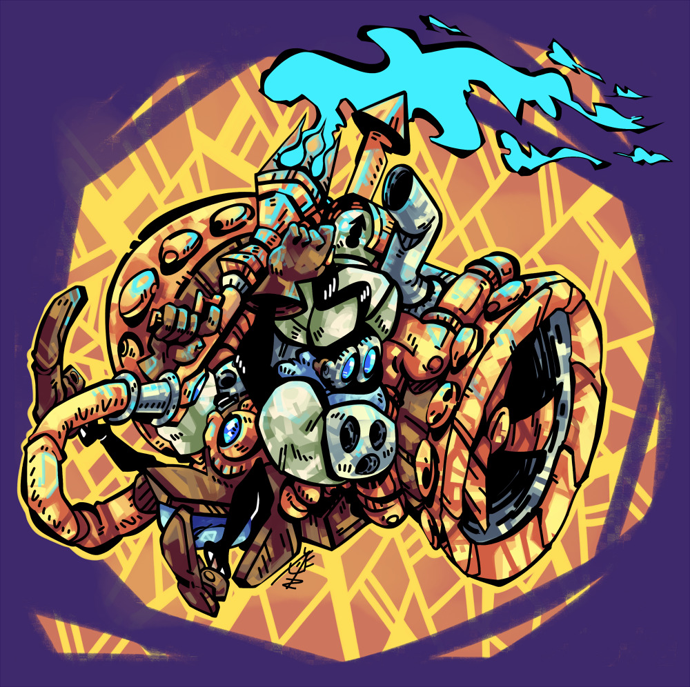
Yeah, I would make the lines on the silhouette of the character thicker than other lines around him. Like on his left arm, the thick lines are the ones overlapping his body, rather than where his shoulder overlaps the machine.
No, but that does really make the picture pop!
this friend has good taste.
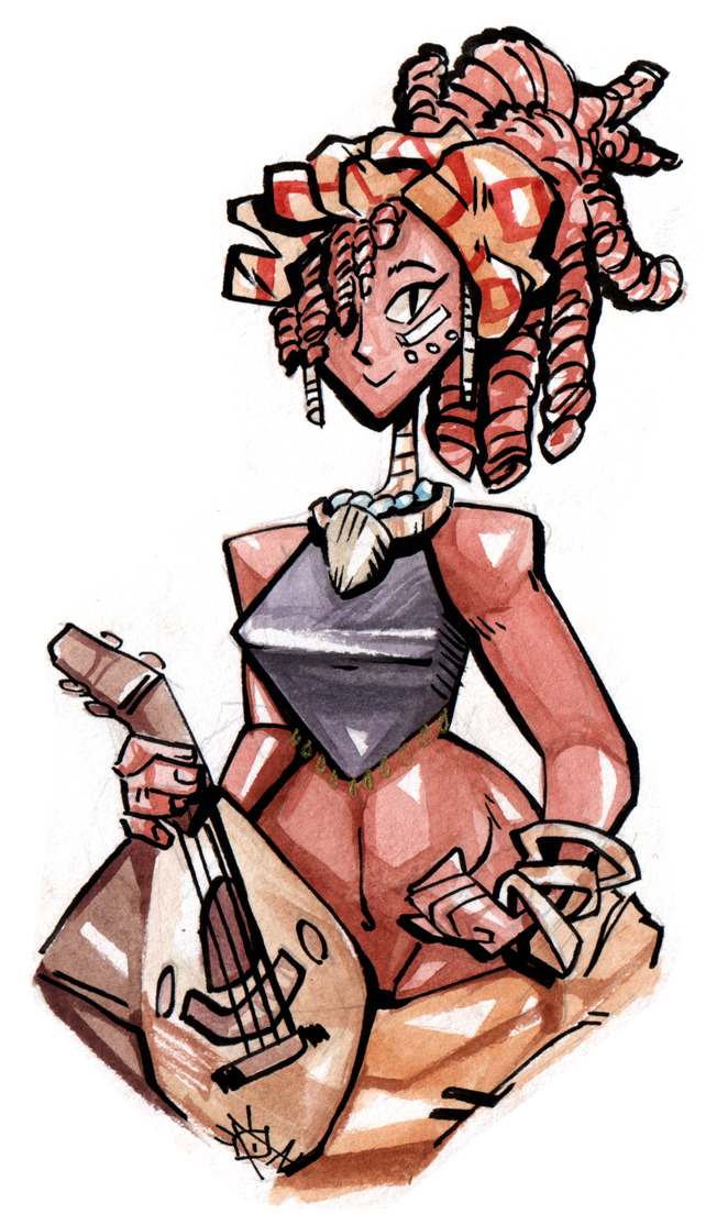
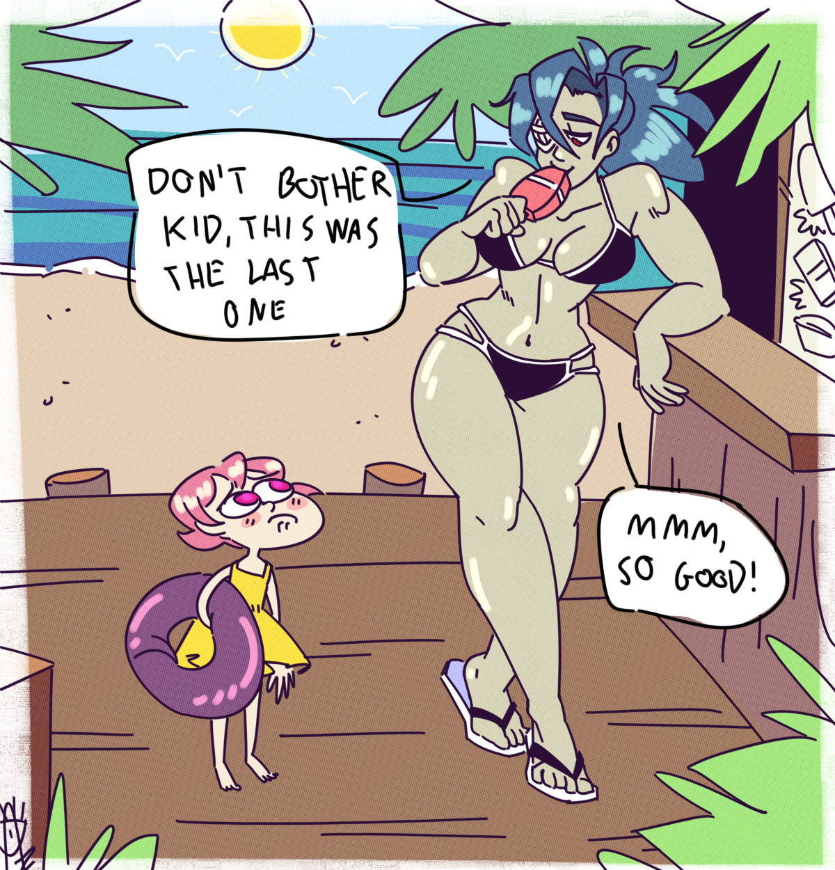
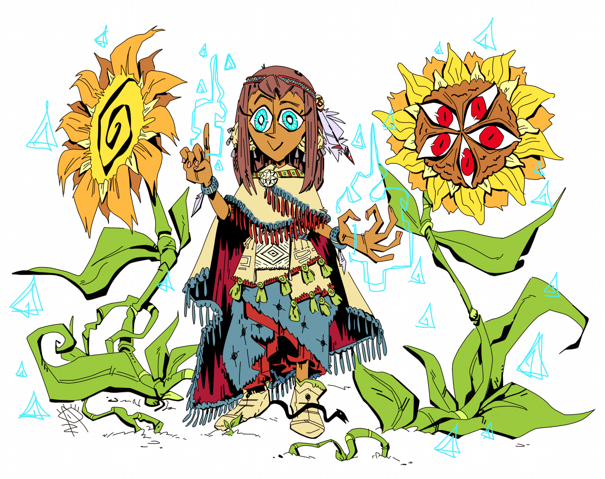
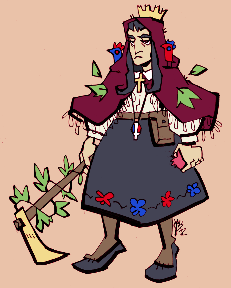
She's entirely based on my hometown culture, Gravina in Puglia.